Forum Replies Created
-
AuthorPosts
-
matteventu
BRONZE MemberAh, there is light at the end of the tunnel! Chromecast = Google Home – an app I hadn’t installed … Thank you very much, MM! May I ask another question? Is there a stationary streaming device you would recommend using with the A9? At this point I’am rather fed up with my Fritzbox/external HDD via USB solution. Thanks, again! B.
Define “stationary streaming device”.
matteventu
BRONZE MemberI ordered one yesterday. Looks like just what I have been wanting to use with my 1s. For what it is designed to be, it is perfect for what I want it for. Does everything an Essence or Core would but has the newer Mozart sound adjustments just as my 28s and Theatre have. And, minimal price increase over the Core and better design if I want to leave it out in the open.
Well technically, it doesn’t have digital out (other than USB-C) which Beosound Core has (TOSlink).
Better design is relative, I’d say Beosound Core look much more discreet.
Beoconnect Core will age much faster than Beosound Core in terms of aesthetics.
matteventu
BRONZE MemberDisappointed that it doesn’t have WiSA transmitter built-in, given the price (£999 / $1150). And that there’s no surround support – it would have been nice given the addition of HDMI ARC.
But what disappoints me the most… No optical or aux output whatsoever.
matteventu
BRONZE MemberItaly, are you able to share it? Thank you in advance
Sorry, “state” as in is it working, do you have access to a sideloading app or to adb to push some apk files manually, etc.
Ps: I’m from Italy as well ?
matteventu
BRONZE MemberThe files are not available Nymore in Dropbox. Anyone can share them? Alberto.sottocornola@outlook.com +393409645938 Thanks
What state is your TV in?
By the look of it, all the “updater” exe does is sideloading newer versions of the Google Play Services, Chromecast built-in and YouTube app apks.
1 March 2024 at 01:39 in reply to: 3 generations of the B&O app – which one would you prefer? #50557matteventu
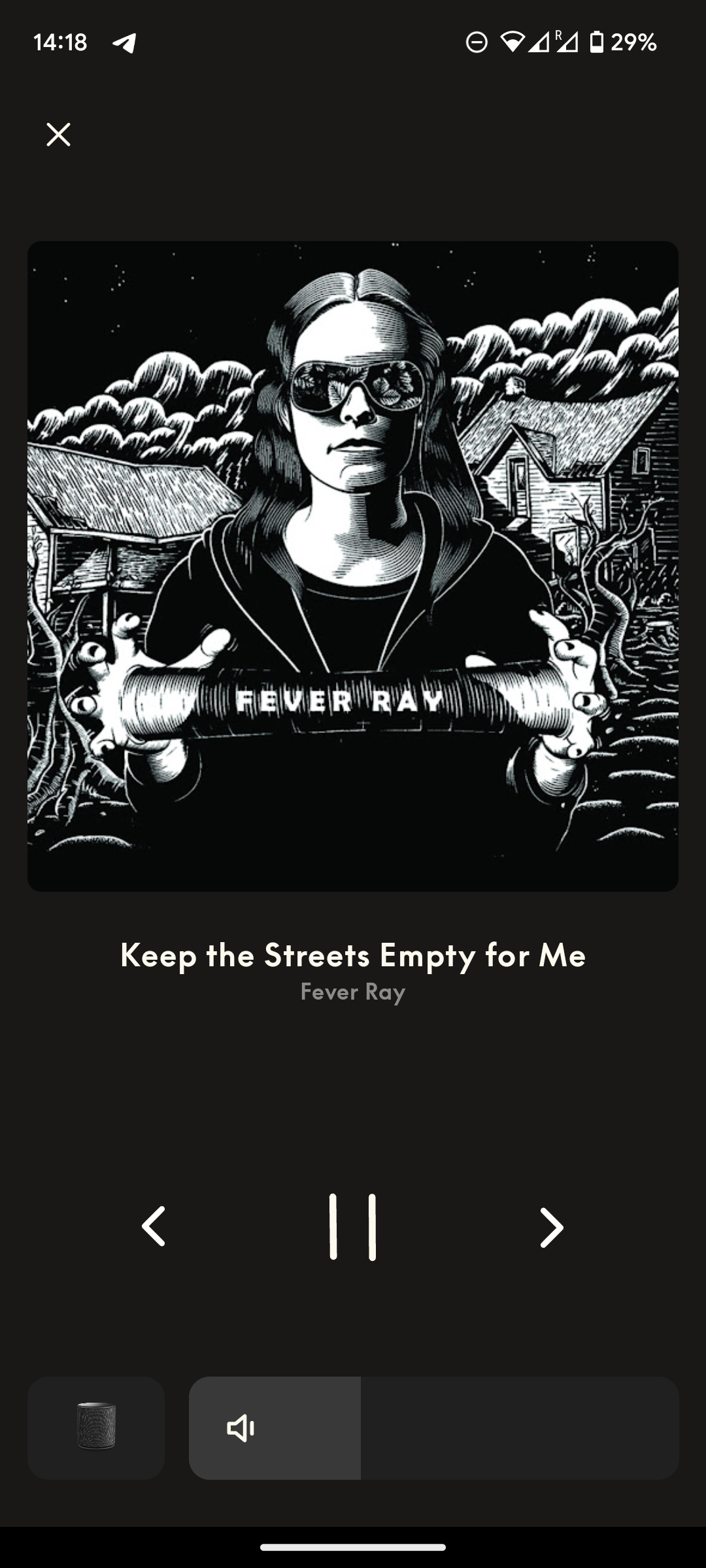
BRONZE MemberThe new “now playing ” screen is objectively worse than in the older app. It’s not a matter of preferences.
Could the older layout be improved? Surely! Plenty of things to improve and make it even better.
Is the new layout an improvement? No, in no way whatsoever.
And the fact that B&O doesn’t see that is really concerning for the future development of the app.
matteventu
BRONZE MemberJust noticed that Beoplay HX have had a price increase, for the first time in their life. From £449 to £549.
Anyone know when exactly it happened?
Also BS A1 2nd Gen went from £239 to £259, and Explore from £169 to £219 lmao.
They’re going absolutely mental.
matteventu
BRONZE MemberBear in mind that default presets can’t be deleted.
matteventu
BRONZE MemberYes that is progress. But there is still a long way to go before we are able to do, what we could in the previous (regular) version.
Why shouldn’t we be able to access the internal sources (such as B&O Radio……) from Source List? Would be nice to know if that is coming (again) in time…. ……or if these will be left out for good in the future app versions! But it is nice to be able to start e.g. CD from there – something (by the way) that we still miss on the BST. MM MM
You’re never going to see B&O Radio, Music an Deezer again in that list, no matter how long you wait or pray ?
They’ve made it clear they are going to include in the sources list only linked external sources, such as aux-in, optical in, or BLC connected products.
All “software-side” “sources” aren’t considered sources you can “switch to”. You just open the respective app/page and play it from there, selecting the B&O device as an output.
Now that I write it, I realise it would therefore make much more sense to those items being referred to as “input list” rather than a generic “sources” (and would create less confusion).
matteventu
BRONZE MemberNot coming anytime soon, or it would have leaked in the app with Beolab 8, the new Cisco earbuds and the XX-XX (won’t mention the name to not get my post removed).
matteventu
BRONZE MemberWhen you connect the speaker to Spotify, do you do it via Spotify Connect or Chromecast?
matteventu
BRONZE MemberYup just seen it!
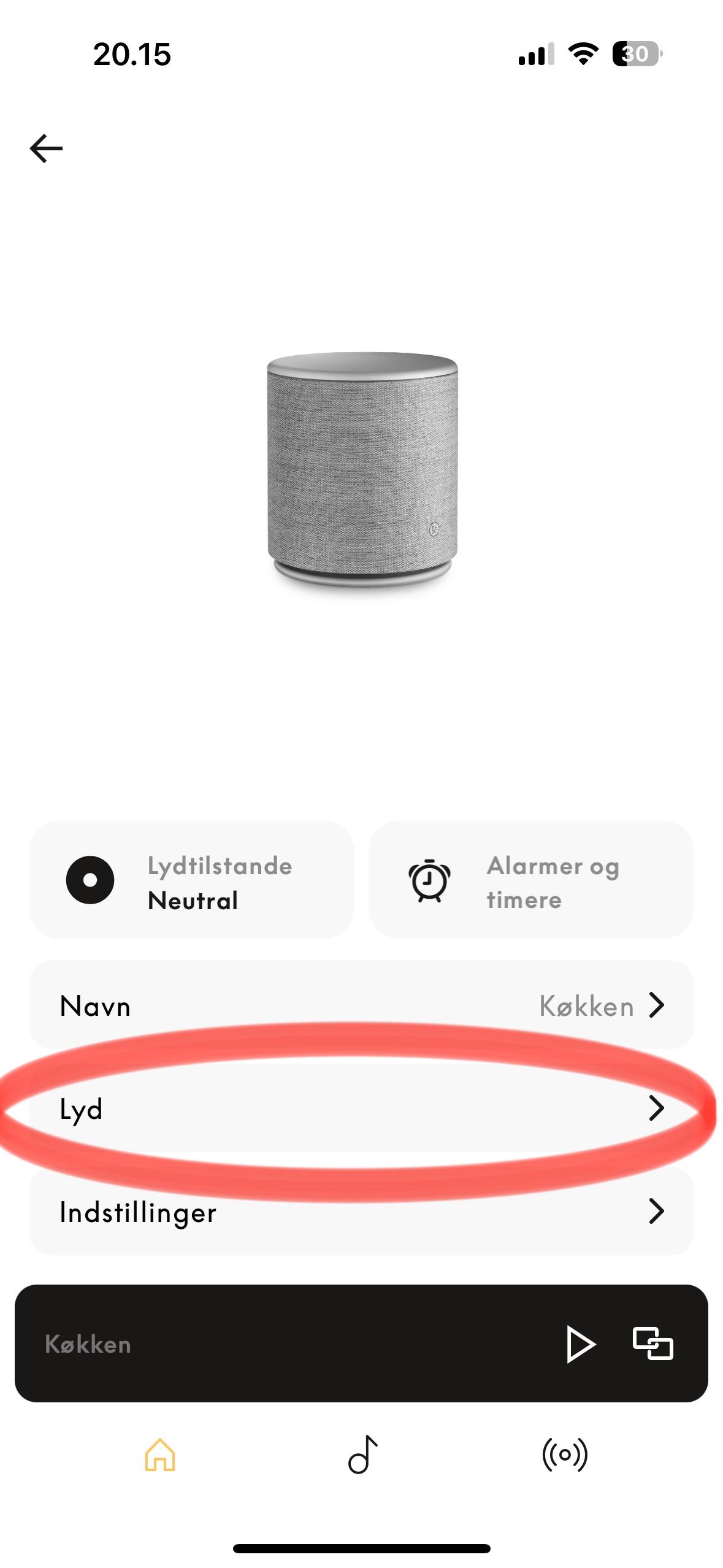
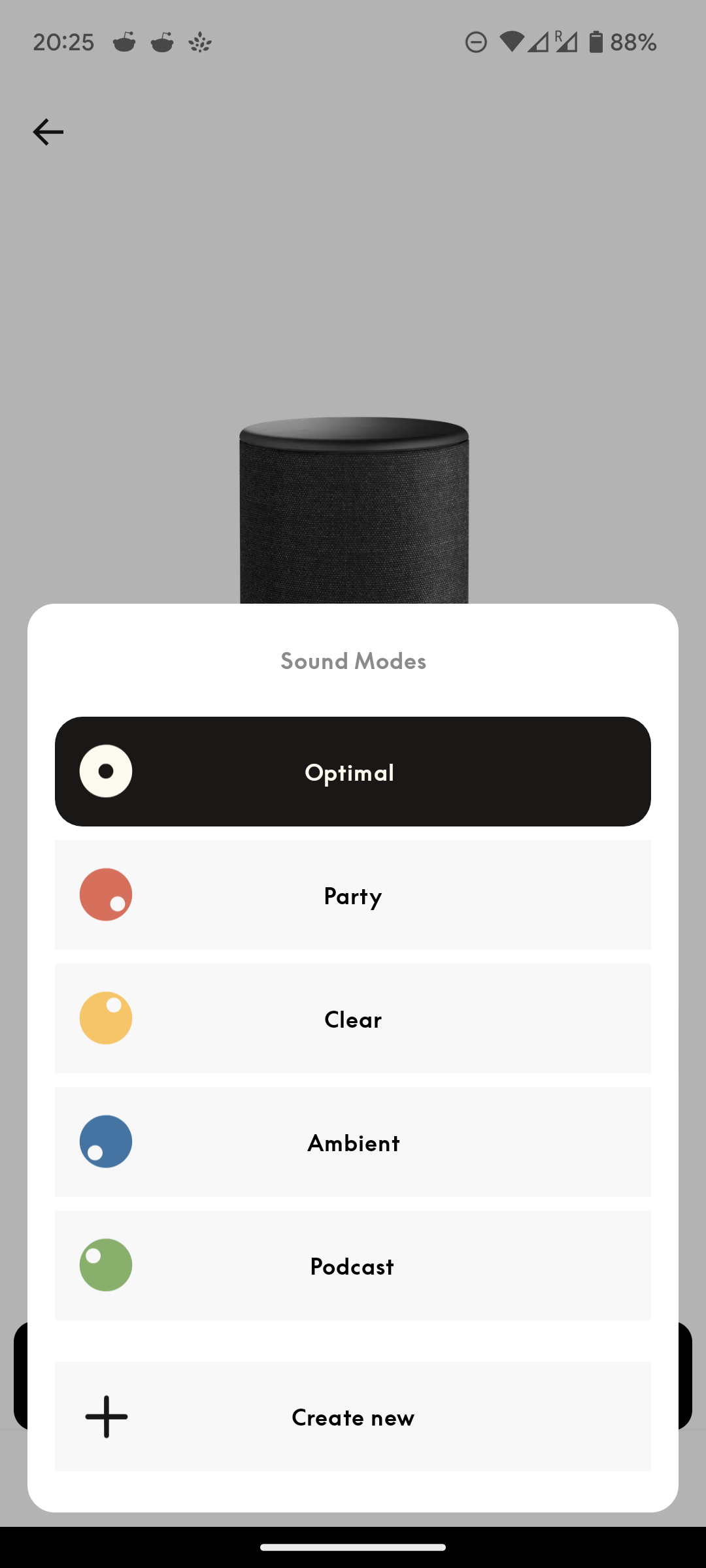
I see your sound mode is “Neutral”. Did you create it manually, or it was already available in the list? For me the optimal/neutral preset disappeared with the update to 5.5.
matteventu
BRONZE MemberI did notice that (on my M5/M3, but not for the Essences)….and I thought, well that’s the new look. I can’t say that I am impressed ? I did not dig as deep as you did, though – but I see your points. The Sound Settings – Startup Volume/Max Volume – are gone too. Again – where are the heading with the app? What do they have in store for us? MM
You’re right, also the max and default volume settings are gone! Fantastic, for that (+ speaker placement) we need to resort to the web UI ?
Do your Mozart devices have this UI or are still with the old/normal one?
matteventu
BRONZE MemberBy the way, the “optimal” sound mode that you can see in the screenshots, I’ve created it.
It was no longer present by default lol.
matteventu
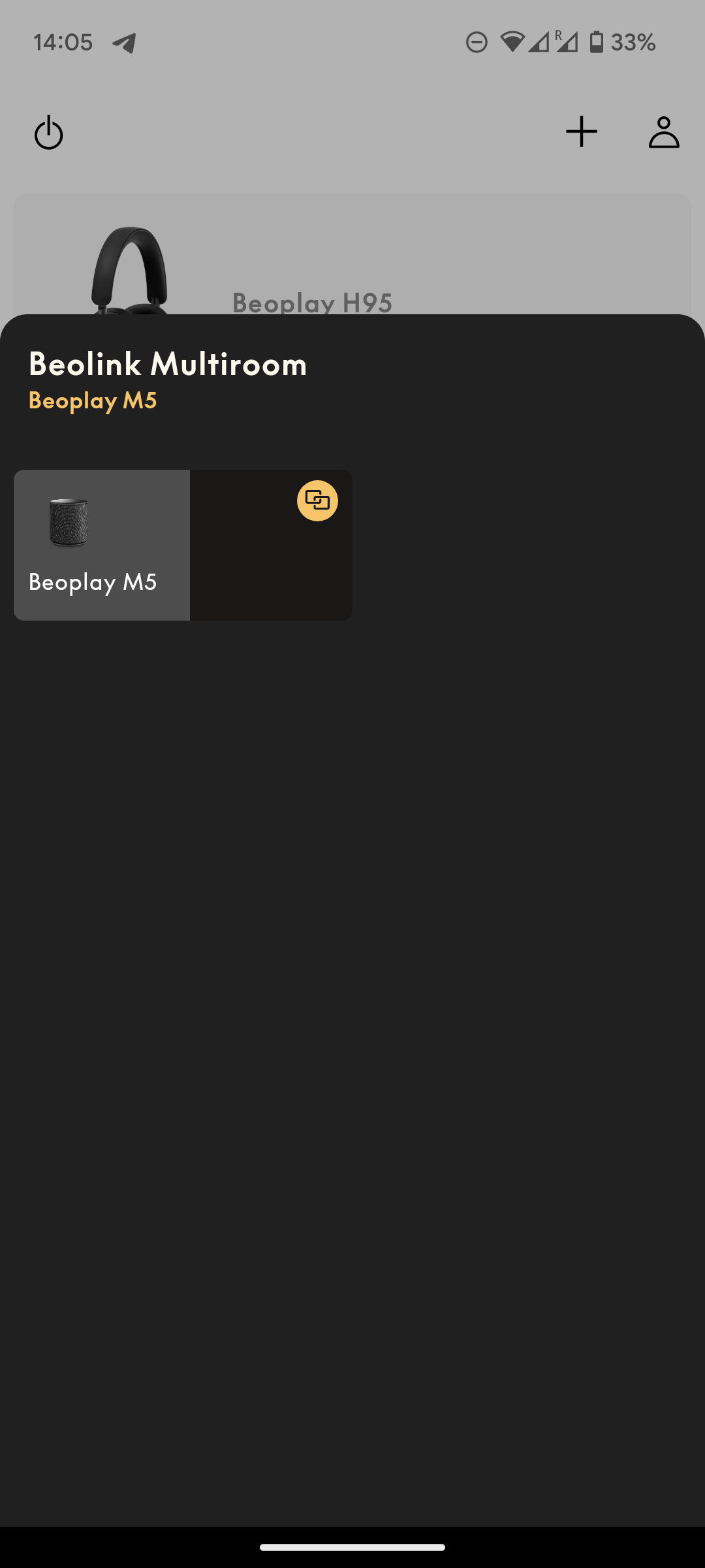
BRONZE MemberSeriously guys you haven’t seen what has changed with the 5.5 version? ?
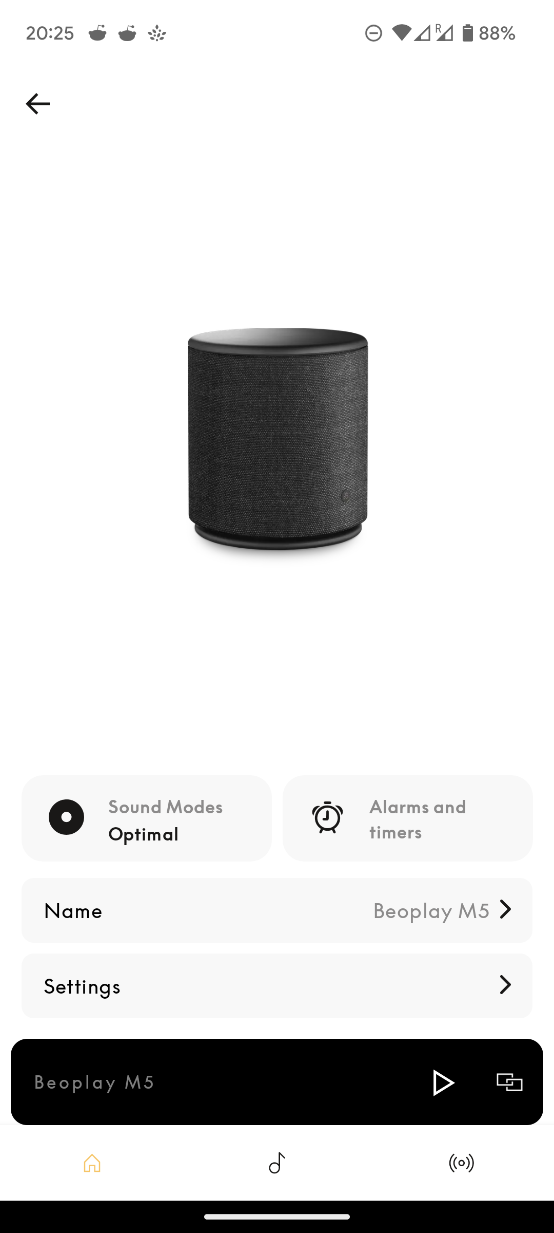
Major redesign of the device screen for speakers (at least, ASE, not sure if they’ve changed it also for Mozart.
I personally appreciate them trying to modernise it but… It’s awful. Literally, awful. Requires more taps for the same operations, plenty of empty space (I know empty space can have a purpose in UI design, but this is not the case here), fewer customisation options (i.e. the “listening modes” presets can’t be re-sorted, or deleted).
Gone is the option for speaker location (corner/wall/free).
They instead brought to the main screen the option to change the name of the product… Something that (in 99% cases) the user literally does one time for the entire lifecycle of the product. Why bring it to the front of the UI!?
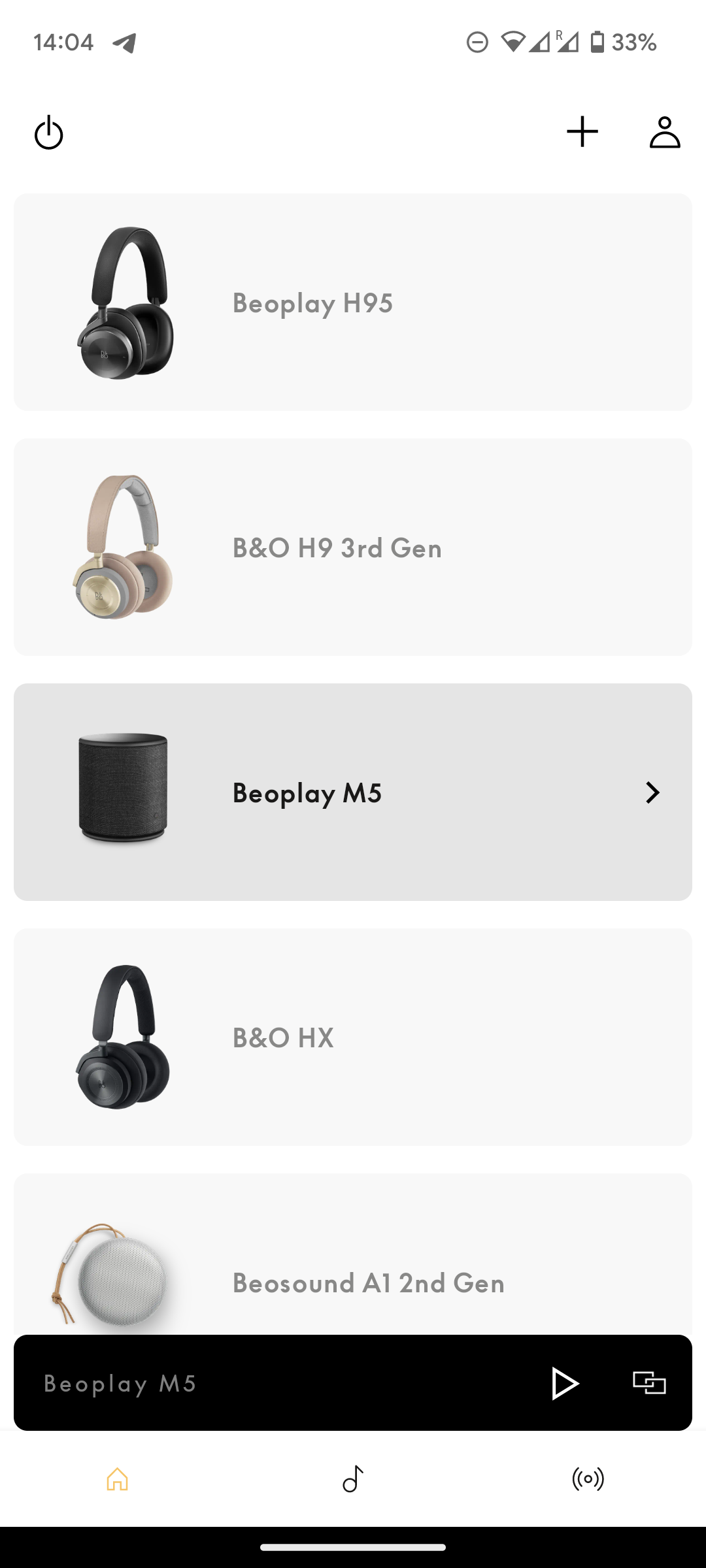
Headphones UI are unchanged.
matteventu
BRONZE MemberI dislike the beta version 5.4.1. It’s horrible and the changes from v5.3 seem unnecessary. And it doesn’t work well at all. I hate the ugly horizontal volume control; the previous circular one was easier to use, especially for fine tuning the volume. It also looked much nicer.
This can’t be stressed enough.
The new volume control bar is tiny and is a major downgrade compared to the stylish and accurate bar of version 5.3.
matteventu
BRONZE MemberNew pair of headphones. Two pairs of earphones. Two pair of Cisco-branded devices.
Not sure about speakers 🙂
matteventu
BRONZE MemberIf you select a Theatre in the app to control, there is a drop down at the top of the black Now Playing screen. Looks like this drop down should contain all the sources (as the 3 dots have until now). But all it shows is Line In and USB. I barely use the app beyond settings, so none of this especially bothers me – but it would nice if the rollout was not regressive in some respects.
Out of curiosity, can you post a screenshot of the source drop-down that you get on Theatre?
(both in opened and closed state)
matteventu
BRONZE MemberI have to be careful what I say because of any potential NDA issue. I have reviewed the operation of the new BeoApp 5.4.0 and gave comments back on its usability and other issue.
There’s no NDA on the Beta app 🙂
matteventu
BRONZE MemberI came here as soon as I tried the new player.
First I have to say that I work in software, so I know users are often against change for dumb reasons.
However.
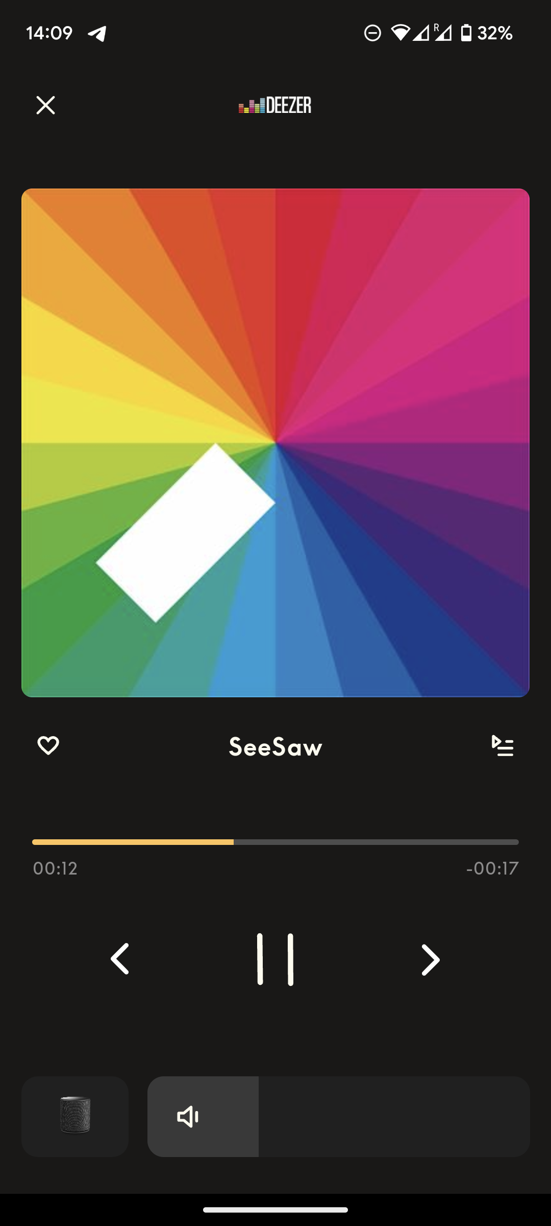
B&O really needs to fix fundamental issues with the app before updating the playing screen in such a way that massively affects performances.
B&O app has always been laggy in some menus, with horrible scrolling stuttering (for instance, the “add new product” screen). At least, on Android.
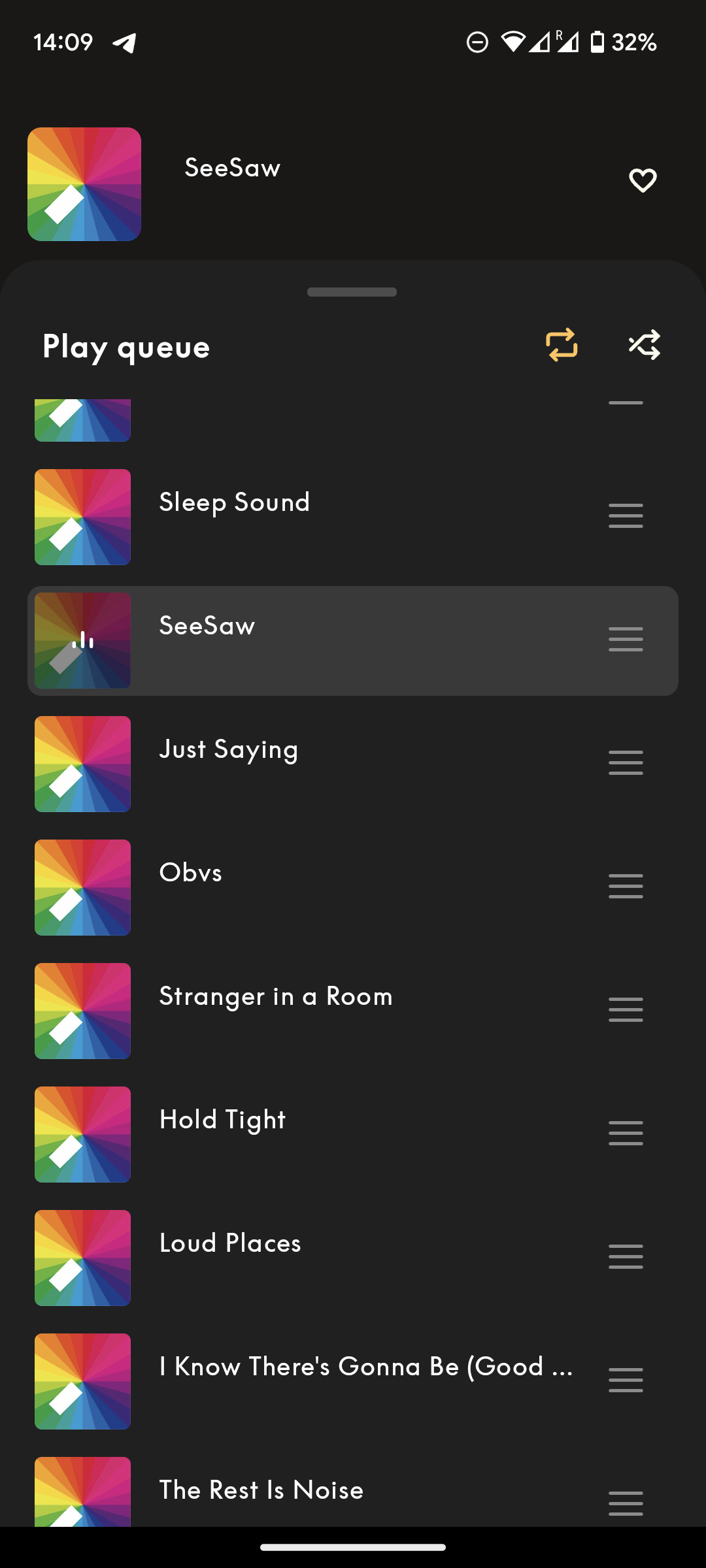
The new queue system they’ve implemented with the new player has the same scrolling stuttering issues. I could accept it in the “add new product” page, as it’s something you use once in a while. But for something as central as the queue tray, that’s not okay. B&O should first rewrite the app and clear up the codebase before redesigning something like this.
I see your screenshots of the iPad version. On the smartphone version the layout of the home page hasn’t changed as much.
I personally don’t dislike the new redesign, but it has some issues.
- Source selection/standby button missing
- Queue tray is extremely laggy and the “move” songs (drag & drop) action is completely bugged
- Swiping on the cover art to change song previously was perfectly smooth, now this is laggy too (animation has extremely low frame rate)
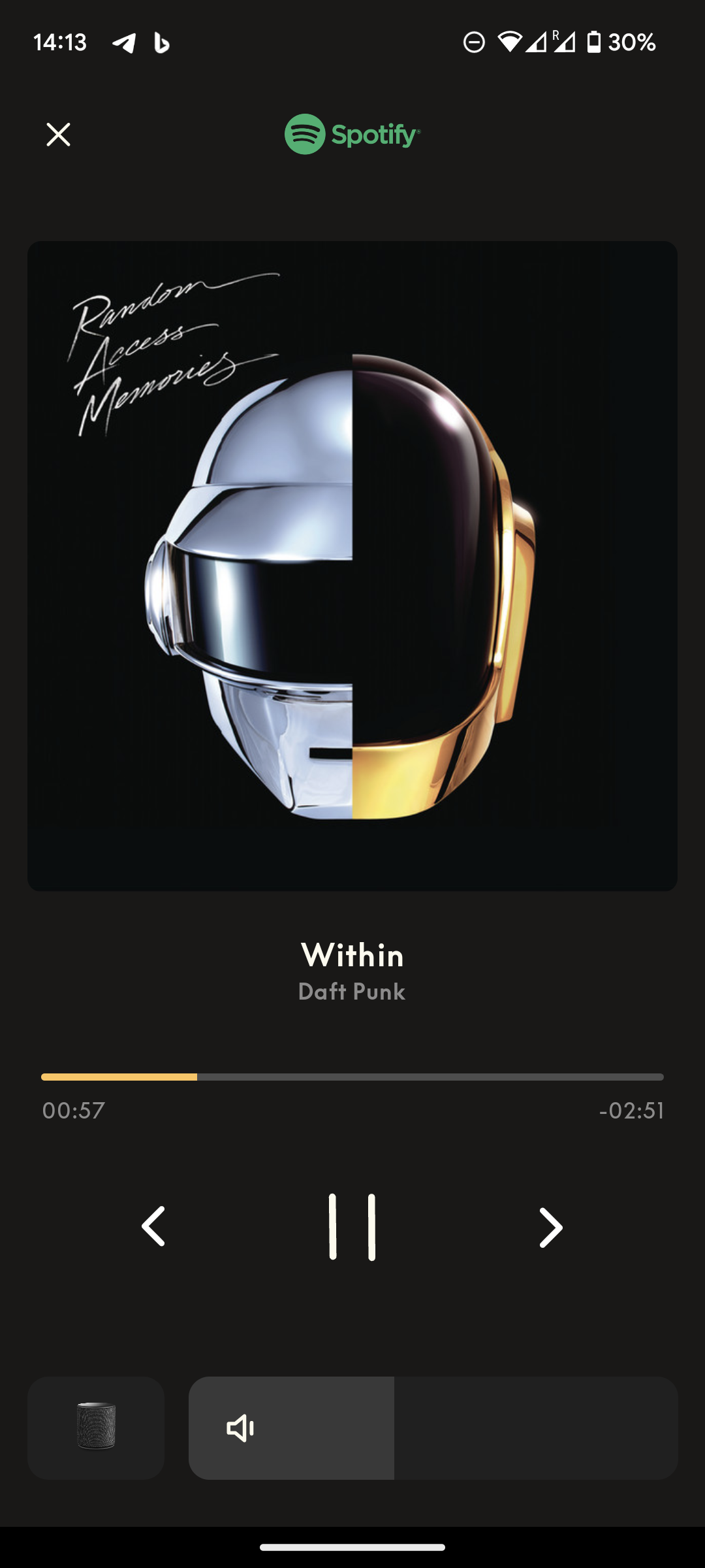
- The new volume bar is okay in terms of looks, but a regression on how easy it was to finely adjust the volume level previously (having the swipable area been reduced now to about 1/4 of what it was before)
- When you’re playing from Chromecast, it no longer shows the name of the source service / “Chromecast” at the top (in place of the Deezer/Spotify logos)
- …can’t say whether it will show “Optical” or “Line-in” correctly, as the source button is missing at all so you can’t switch source lol
- Prev/play/pause/next buttons now don’t offer visual feedback when tapped
- When the song title is too long and it needs to scroll, the scrolling speed is too high and the frame rate is very low
- When sources that don’t support/show the seek-bar are active (i.e. Chromecast, B&O Radio, and I guess all external sources), the positioning of the cover art, titles and prev/play/next buttons feels quite unbalanced
So, in a other words, the new player feels extremely cheap. Not very Ultra-High-Net-Worth-Individual worthy.
I say “feels” (instead of “looks cheap”) because it doesn’t necessarily have to do with the look. Look is okay.
Implementation/coding is instead very very poor.
Again, I know this is a beta, but this is the kind of things I’ve always seen passing from beta to stable without any change, so I really doubt they’ll fix everything before pushing to stable, or in the near future at all.
-
AuthorPosts


