


Home › Forums › General Discussion & Questions › BeoWorld Feature / Problem › Report Problems with the Site Here
Tagged: Website
- This topic has 40 replies, 14 voices, and was last updated 6 months, 2 weeks ago by

-
AuthorPosts
-
29 March 2024 at 16:18 #33003
 GOLD Member
Resources increased ?
My B&O Icons:
 30 May 2024 at 17:46 #56089deaddruidGOLD Member
The product pages on the new website appear to be for “products for sale”, rather than “product information”. Can someone tell me where I can find the old product pages? Today I had to go to the Internet Archive to find information about the Beovision 7-40, as I couldn’t find it on the new website.
Mark
Location: UK
Favourite Product: Avant 32 DVD
7 June 2024 at 18:25 #56352Today slower than ever
Location: Mexico city
28 July 2024 at 23:02 #57765Today slower than ever
Hi, there have been some more changes in the backend, I hope it has has an increase in performance.
product information
This can be seen at the following link, there are currently no products for sale on BeoWorld, this will change at some point. All products for sale will be kept to the shop though.
My B&O Icons:
4 August 2024 at 12:35 #57980The “Official merchandise Bang & Olufsen” image link at the bottom banner doesn’t go to Beoworld.org shop, but instead goes to the official B&O website (like the one left to it).
Location: Helsinki - Finland
My B&O Icons:
4 August 2024 at 13:26 #57987Thank you for letting me know, I have updated some of the links.
My B&O Icons:
21 June 2025 at 07:54 #66564EvanGOLD MemberHey guys,
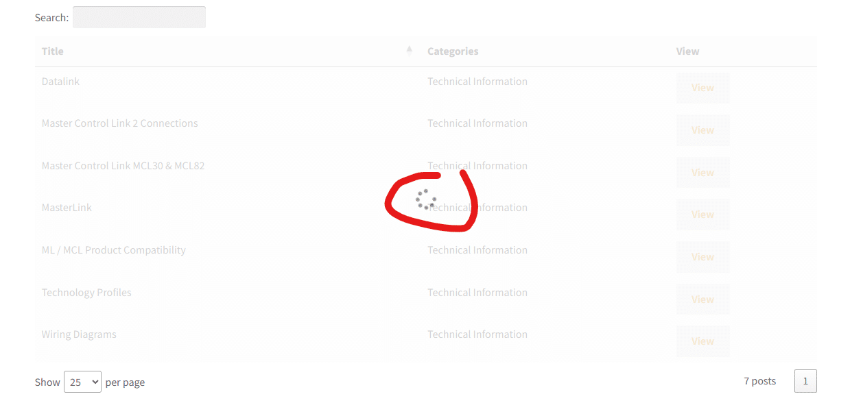
Struggling to access normal resources in the BeoTech area, these are just loading and loading and loading etc..
Lot’s of waiting here, just trying to load some basic wiring diagrams so I can make a cable.
Location: San Francisco
21 June 2025 at 17:42 #66578Struggling to access normal resources in the BeoTech area
Should be resolved now.
My B&O Icons:
3 October 2025 at 07:39 #70080Used to be a “Report” button beside the “Reply” and “Quote” buttons in message header stripe?
In any case, reporting: posts #69374 & #70058 are phishing spam to hacked-android-apps sites. One userID was recently created for this single reply, and the other was… lurking for 4 years, to upload just one poisoned link?!? Remarkable persistence.
3 October 2025 at 09:09 #70085Thank for letting me know, they are gone now.
I will check to see where the Report link has gone.
My B&O Icons:
20 October 2025 at 14:45 #70594Sorry for the outage today, the electrician had some issues and knocked off our whole building 😆💡
All back to normal now.
My B&O Icons:
16 November 2025 at 14:54 #71235Hi Mark,
When I try to upload a picture using the “insert image” key of the menu bar, the message “upload failed for xxx”.
I used small size jpg files in order to minimize the load on the server and they are uploaded without problem as an attachment.
But it is far less practical since you cannot insert images to illustrate your “words.
Where is my mistake?
It might be useful to add “how to” guide as a sticky note.
Kind regards,
Yann.
Location: Brittany, France
My B&O Icons:
16 November 2025 at 19:23 #71253When I try to upload a picture using the “insert image” key of the menu bar, the message “upload failed for xxx”.
I think this is now resolved – I hope 😅
My B&O Icons:
16 November 2025 at 19:32 #71255Sorry Mark,
Now it shows : Invalid nonce.
Regards,
Yann.
Location: Brittany, France
My B&O Icons:
16 November 2025 at 19:41 #71258ok, I will keep on it.
It’s working fine from my side, but this could be to do with my user level.
My B&O Icons:
16 November 2025 at 20:24 #71264Mark CooperBRONZE MemberTest post
16 November 2025 at 20:31 #71266Mark CooperBRONZE MemberNow it shows : Invalid nonce.
Can you hard refresh the page just to make sure.
16 November 2025 at 20:55 #71268Test
It worked.
Location: Brittany, France
My B&O Icons:
29 December 2025 at 18:50 #72183Mark CooperBRONZE Member
Test29 December 2025 at 19:07 #72184MadskpGOLD MemberI also got this error today, and ended up attaching files instead of inserting pictures in the Beolink 5000 repair thread. In the same thread Guy have inserted pictures without issues
Location: Denmark
-
AuthorPosts


- You must be logged in to reply to this topic.