Home › Forums › Product Discussion & Questions › BeoApp › App version 6.0.2.xxx
- This topic has 24 replies, 10 voices, and was last updated 1 year, 7 months ago by
L1no.
-
AuthorPosts
-
5 July 2024 at 12:46 #57209
New layout again.
Missing the “kill all” possibility in the app. Maybe hidden somewhere.
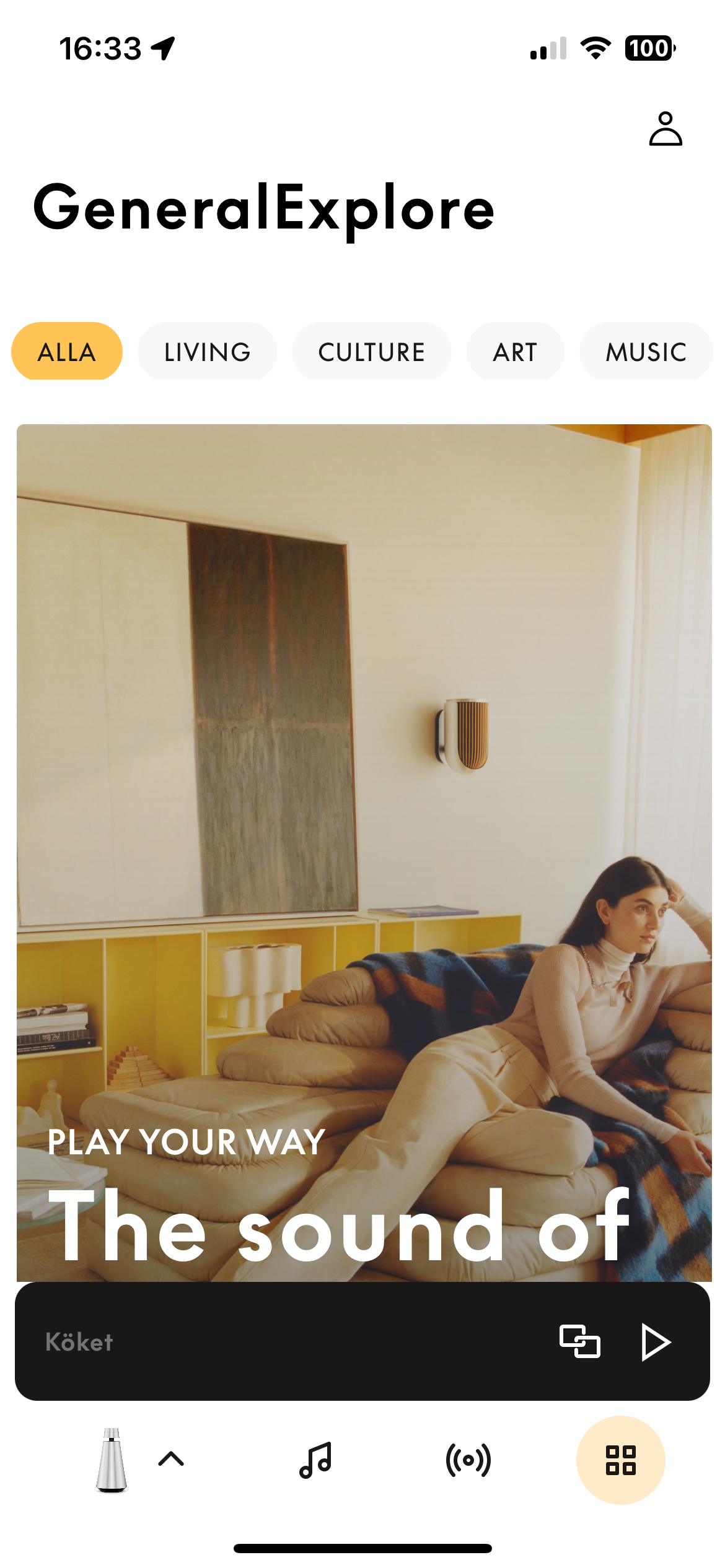
A bit odd adding a “marketing button” as I call the button with 4 squares to the far right…
Location: Sweden
My B&O Icons:
5 July 2024 at 14:12 #57219App hasn’t appeared for me yet but I do like that button on the bottom right to select the product. I assumed that this was coming soon as it was shown online at the beosound 9000c release.
Location: Toronto, Canada
5 July 2024 at 15:35 #57223This is where you are coming if you press the button to the far right in the bottom:
Location: Sweden
My B&O Icons:
5 July 2024 at 17:26 #57228well… easy enough to ignore. The app itself has way bigger problems.
Location: Toronto, Canada
5 July 2024 at 18:15 #57230Stan
BRONZE MemberUnfortunately, it appears they are just following the lead of almost all the other home product related apps on my phone. They all have sections that hawk new and improved products, replacement parts, upgrades, etc. Some of the worst ones make your scroll through that crap before you actually get to the useful features of the app. At least B&O has placed this behind an easy to ignore button vs. integrated to the main product operation flow.
6 July 2024 at 01:57 #57234NQVHNWI
BRONZE MemberThe App to me is broadly:-
80% One-Off Setup configuration of products
10% Running Setup/Configuration (Multiroom/volume/tones etc/listening positions etc..)
8% Music interaction and selection (Radio channels/FLAC on my NAS, no possibility of Qobuz for me yet)
2% Marketing guff I can read about on my PC or tablet…or here or other places about poor little Charles LeClarke etc…)
They (B&O) really have this App messed up into a gordian knot of uselessness. Just a fraction of the App is dedicated to music or video listening/watching and the interacting of such. Too much is dedicated to setup (which should have been long-fixed for ASE and Mozart platforms).
I hope Charles LeClerke and his fellow over-privileged ambassadors don’t start eating into the remaining 8% of the remaining useful part of the App?
6 July 2024 at 19:55 #57273New layout again. Missing the “kill all” possibility in the app. Maybe hidden somewhere.
This feature was very useful when using the “join” feature.
Thus, a valuable function removed and a useless gadget introduced.
What a mess! I’ll stick to 6.0.1 for the moment.
Yann.
Location: Brittany, France
My B&O Icons:
18 July 2024 at 01:09 #57486matteventu
BRONZE MemberOdd, 6.0.2 on Android still has the “old” layout.
Thus, a valuable function removed and a useless gadget introduced.
Which has been the trend for the last two years…
21 July 2024 at 08:43 #57543TinusAMS
BRONZE MemberDoes anyone know how to delete a Sound Mode? Swiping right to left does still work with Listening Positions, but not with Sound Modes…
ps. I’m on iOS and it’s a sound mode I created myself, not the B&O ones.
My B&O Icons:
23 July 2024 at 00:01 #57579matteventu
BRONZE MemberDoes anyone know how to delete a Sound Mode? Swiping right to left does still work with Listening Positions, but not with Sound Modes… ps. I’m on iOS and it’s a sound mode I created myself, not the B&O ones.
Sweeping the listening mode towards left should reveal two buttons: edit and delete.
23 July 2024 at 09:18 #57582TinusAMS
BRONZE MemberHi,
Yes, that works with Listening Modes but not with Sound Modes…
My B&O Icons:
16 August 2024 at 12:03 #58339Beofile7
BRONZE MemberI have just updated my Iphone and as a result am unable to select and control BL50. The icon is there but selecting it does nothing. All other icons are responsive. I have rebooted all products and the iphone, all to no avail!
16 August 2024 at 13:14 #58342Now on version 6.1.1
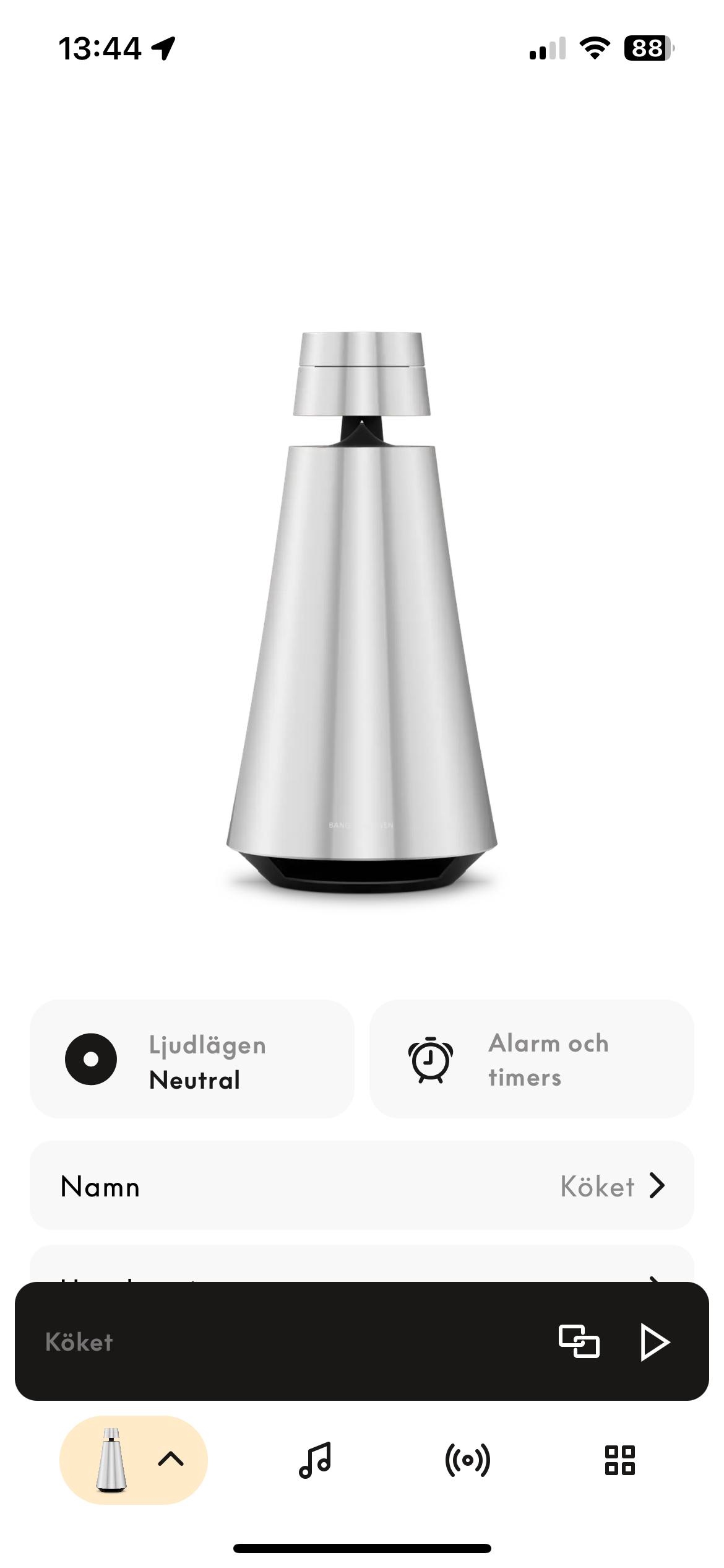
The “kill all” button have been reintroduced. Can be found if you tap the product icon down to the left.
The “advertizing button” has been removed.
Location: Sweden
My B&O Icons:
16 August 2024 at 14:26 #58345I have just updated my Iphone and as a result am unable to select and control BL50. The icon is there but selecting it does nothing. All other icons are responsive. I have rebooted all products and the iphone, all to no avail!
Same for me.
Location: Brittany, France
My B&O Icons:
16 August 2024 at 17:05 #58355This might go against popular opinion but this new version seems to be on the right track in terms of UI. Still a bit wonky though.
Location: Toronto, Canada
17 August 2024 at 09:59 #58379Hi,
Installed version 6.2.0 today.
BL50 are now selectable.
I agree with Severed, UI is improving.
Yann.
Location: Brittany, France
My B&O Icons:
17 August 2024 at 16:21 #58399The only thing I find incredibly weird in the current app is that the interface from switching products and selecting multiform speakers is very similar to one another and I sometimes do one when I mean the other.
Location: Toronto, Canada
17 August 2024 at 18:05 #58403The only thing I find incredibly weird in the current app is that the interface from switching products and selecting multiform speakers is very similar to one another and I sometimes do one when I mean the other.
On my iphone, switching between products shows on a white backgound and joining multiroom products is on a black one.
But maybe I misunderstood your remark.
Location: Brittany, France
My B&O Icons:
17 August 2024 at 18:29 #58407Correct. And this is logical to you?
Location: Toronto, Canada
18 August 2024 at 08:43 #58414Beofile7
BRONZE MemberI just checked… 6.2.0 is not yet available here.
-
AuthorPosts
- You must be logged in to reply to this topic.


