Home › Forums › General Discussion & Questions › General Discussion & Questions › A new YouTube review of the BS3200
- This topic has 12 replies, 10 voices, and was last updated 2 years, 4 months ago by
auric.
-
AuthorPosts
-
18 November 2023 at 06:21 #50521
XavierItzmann
BRONZE MemberAfter 26 years of B&O ownership, the user interface on David Lewis-era devices appears natural to me. In fact, in a Masterlink scenario, necessary, even. It was interesting to see most aspects of the BS3200 reviewed on Techmoan’s channel, where the user interface surprised him.
This here our beloved website makes a short appearance, by the way.
I think the video may throw some light on how non-B&O consumers of a certain age perceive the brand. His previous two videos, which were about the Beosound A1, generated, respectively, 216,000 and 140,000 views, which is low for a channel with 1.3 million subs.
We’ll see how this one does.
19 November 2023 at 06:58 #50524Maybe interesting for those who want to dig a bit deeper into the thought behind the remote controls from B&O.
I feel sorry for this guy who waited 25 years to experience a B&O device from yesteryears…..who had to admit that it actually was quite good, once he got used with the philosophy behind it.
The ‘red dot’/standby is a very logical concept.
Since the late 80’s the Bang & Olufsen remotes were made to control several different products (in the B&O ekosystem) – the A/V Terminal and then the Beolink 1000.
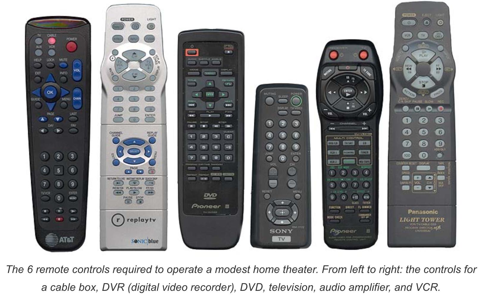
Where other had to have several remotes, one for each product, B&O had one, where you could turn on/switch to the wanted source directly by using the source button and turn the device off with one button (the red/standby button) – this was also used for turning off the entire system by a long press (later as the first multiroom systems from B&O came).And only unlogical for those who prefered to have multiple different remote controls for their devices.
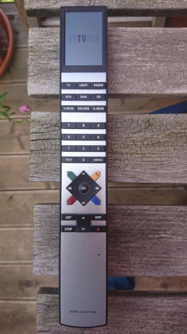
A ‘Go’ button for accepting the choices one has made, when setting up things in menus, with several steps is unavoidable – how would you do it without?
In the end it is this:
….or that:I surely would have to adapt to the UI of these monster remotes.
Please give me a clean, nice looking remote, where you can control all basic features of several devices intuitively.
I have a feeling that this classic hifi guy wants it complicated – after all it is his hobby and – probably – also his bread and butter.
MM
Location: Flensborg————Danmark
19 November 2023 at 13:09 #50522Madskp
GOLD Memberyes it is interesting to see how he reacts to the controls which is almost second nature to those of us who have used B&O equipment for several years.
But I think it’s the same feeling I have when i get a remote from another brand and have to find out how to use that 🙂
A little funny that he thinks that the control interface has not got much attention when in fact B&O in that period had a team dedicated to controls of their products.
Location: Denmark
19 November 2023 at 16:20 #50523I came to B&O late and as a UX designer for 25 years I can certainly feel for his issues with the UI. It’s not intuitive, it for sure prioritizes design over usability and at the very least it is unfriendly from a universal language regarding interface elements such as “go” and the red power button. The radio tuner interface looks like a nightmare too.
That being said after you get used to the interface its fine. But this is a strong example of you having to adapt the the UI over it adapting to you.
Location: Toronto, Canada
19 November 2023 at 23:53 #50525XavierItzmann
BRONZE MemberI do not dispute @severed_hand_of_skywalker’s perspective, but I’ll say this:
The evening we purchased our first B&O and powered speakers, I remarked to my wife that the red light/green light indicators on our new speakers and CD player were genius:
• red dot on each speaker, plus on the CD player: all standby.
• green light on each speaker, plus the green displays on the CD player on: all on.
• red dot button on Beo4: all standby.
Still looks perfect to me. Even our BS5 has a red dot standby light.
20 November 2023 at 15:47 #50526Imagine someone in Japan or ANY non-english country trying to use a B&O product with the word “GO” for play.
How does “go” even apply to playing music? its such a disconnect. Instead of “go” it should be the universal standard of the right facing triangle.
Why do they have a button with a circle and one with a red bar? How does one mean power and the other something else? Whats wrong with the universal icon for power thats used on every other electronic product?
I think the biggest problem is that there is no logic or prioritization in the button layout. Everything is just a grid to make it look nice.
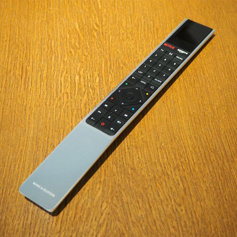
All those 3rd party remotes are horrid looking but they all do have more logic than the layout of the Beoremote 1 which is a masterclass of the worst designed remote ever made possibly by anyone. I dare anyone to feel their way around this remote or use it in the dark.
Location: Toronto, Canada
20 November 2023 at 21:57 #50527Stan
BRONZE MemberMy family has long given me crap about how *hard* it is to use B&O equipment. My son likes to say that it is annoyingly different for the sake of being different… as in, there’s no value in its differentness. I learned a long time ago that it’s a waste of time to argue about UXs… people like what they like (and dislike what they dislike).
My answer to them has always been that B&O is mostly easy and intuitive if you have never used any AV equipment before. So, step 1 to learning B&O is to forget everything you already know about AV equipment. Most of these UX “standards” that Luke’s hand mentions probably were not standard when B&O first decided that a red dot means “standby” and “Go” means “Play”. I know my first turntable and cassette deck used “Play”… I don’t recall the triangle showing up until maybe the walkman, and then it took 5 – 10 years before it became “standard” (of course, I’m getting on in years so my memory may be spotty). Having chosen their path back in the 70s, they stuck with it.
About the “no thought” on the button layout of the BeoRemote, from all the examples shown on this thread, only the B&O remotes have the numbers in a logically useful order. Everybody else goes from 1 at the top left to 9 that the bottom right. Meanwhile, B&O has 1 at the bottom left and 9 at the top right. Why does this matter? At least in my experience, I select a lot more channels that start with 1 – 3 vs. 4 – 9. Therefore, on average, my finger doesn’t have to reach as far vs the “standard” numeric layout.
20 November 2023 at 23:26 #50528In the end it is this [multiples remotes] ….or that [a sole beautiful Beo4]:
Given you have an expensive Beovision TV set, an also expensive Beocenter Sound set, Beolights, Beothis and Beothat…
I reckon the integration is clever and very sexy but let’s understand this is not to everybody and that poor human beings having to deal with mixed AV systems don’t have to suffer the shame to have multiples remotes on the living room table.
Funny enough that nowadays Beoremote systems have to accommodate with third party TV brands just to keep that “one only remote” concept alive…
Don’t misunderstand me: Il love all being controlled by a Beo4 or a Beo6, but lets agree this not for everyone and be open minded.
Location: Paris France
21 November 2023 at 00:32 #50529Evan
GOLD MemberWhat an incredibly complex (but exciting!) topic to discuss. Honestly I’m surprised it hasn’t come up sooner. What a great thing to investigate further as well. It would be great to hear from B&O and how some of the designers have worked with this as it has somehow been protected and coordinated very well over the years.
The logic is much deeper than most people realize.
I think the “GO” topic is important to separate here as it is more than simply a “play” button. It is more like an “enter” key especially when using a BV or more complex BeoSystem etc. However in many situations it isn’t actually needed. As soon as a CD is loaded for example, all you need to do is select “CD” on the device BS/BM/Beo4 or otherwise and it plays, activates the speakers and configures the system for that function. This is one of the many simplicities I appreciate about B&O’s approach here. All I need to do is press V.MEM and I can have the Apple TV showing on my BV and off I go! Same for other sources in the system.
There is some strangeness in the B&O remote / button ideology. For instance “STEP” instead of “next” / “previous” etc. but I think its important that good UX design is not simply refining existing ideas norms and going along with what the rest of the world is doing and has been doing for decades.
Its honestly hard to imagine that there is really only one company who has actually gone in a different direction from the norm and attempted to innovate.
The more I live with and use a Beo4, the more it becomes one of my favorite pieces of design ever. It has exactly the kind of balance I strive to put into my own work. Just the right amount of playful design / sculpture that is memorable (and possibly overkill) but also plenty of logic and agonizingly streamlined simplicity.
Location: San Francisco
22 November 2023 at 10:11 #50530ajames
SILVER MemberI was surprised at how difficult or odd he found it, but I’ve been used to Beolink 1000 and then Beo4 for what must be over 30 years so I find other brands difficult to use. For example, the writing on a lot of remotes is too small to read and there are too many buttons. With the exception of DVD1 I have never had any problems using Beo4 or understanding B&O’s language.
I think he summed it up though as he loves the buttons and metres and to know that a HiFi is a HiFi. There are a great many people out there who think like that and thank goodness or it would be a very boring world.
I’ll bet now his interest has been awakened he will go onto buy more!
Location: United Kingdom
Favourite Product: Beocentre 9300
My B&O Icons:
22 November 2023 at 12:24 #50531I was surprised at how difficult or odd he found it, but I’ve been used to Beolink 1000 and then Beo4 for what must be over 30 years so I find other brands difficult to use. For example, the writing on a lot of remotes is too small to read and there are too many buttons. With the exception of DVD1 I have never had any problems using Beo4 or understanding B&O’s language.
Same thoughts here regarding remotes/keypads. I think of the button logic as being similar to a reverse Polish calculator; once you are used to the sequencing it’s actually much easier to use and less prone to input errors.
EDIT: Just to add that I am basing this comment on Beo4 and BL1000 – I have no experience of BeoRemote One.
Location: Warwickshire, UK
My B&O Icons:
22 November 2023 at 22:28 #50532Evan
GOLD MemberHaving had time to finish the lengthy video (good thing) I wanted to come back and say the best part of all this was his final observation – the awesome network built up around B&O. That is something truly unique about the brand – great community and support.
Also have to admit I learned a few things. Haven’t seen the “CD ALL” button before, I guess I haven’t looked too closely at the 3200 before! The automatic door open feature when there is no CD present was new to me as well. I was very excited to test on my Century when I arrived at the office this morning – can confirm it does the same! However only on the device, not with Beo4.
Location: San Francisco
28 November 2023 at 00:39 #50533auric
BRONZE MemberI feel this way even today going from a Windows user to a Mac user. I can’t get use to the Mac interface.
Now I’m the opposite on the phone OS. The iphone is second nature to me, but I struggle with android…
Not all B&O interfaces are as tricky as the BS3200.
The Beocenter 9000/9500/9300 is very intuitive. In fact it masks the buttons that are not relevant to the current mode of operation.
The same is true of the Beolink 7000.
-
AuthorPosts
- You must be logged in to reply to this topic.


