


Home › Forums › Product Discussion & Questions › BeoApp › Bang & Olufsen App – Beta version 5.x.x.
- This topic has 151 replies, 26 voices, and was last updated 2 years, 6 months ago by
 Lalune.
-
AuthorPosts
-
19 September 2023 at 01:30 #49056
 BRONZE Member
Just received the new beta version 5.4.0.
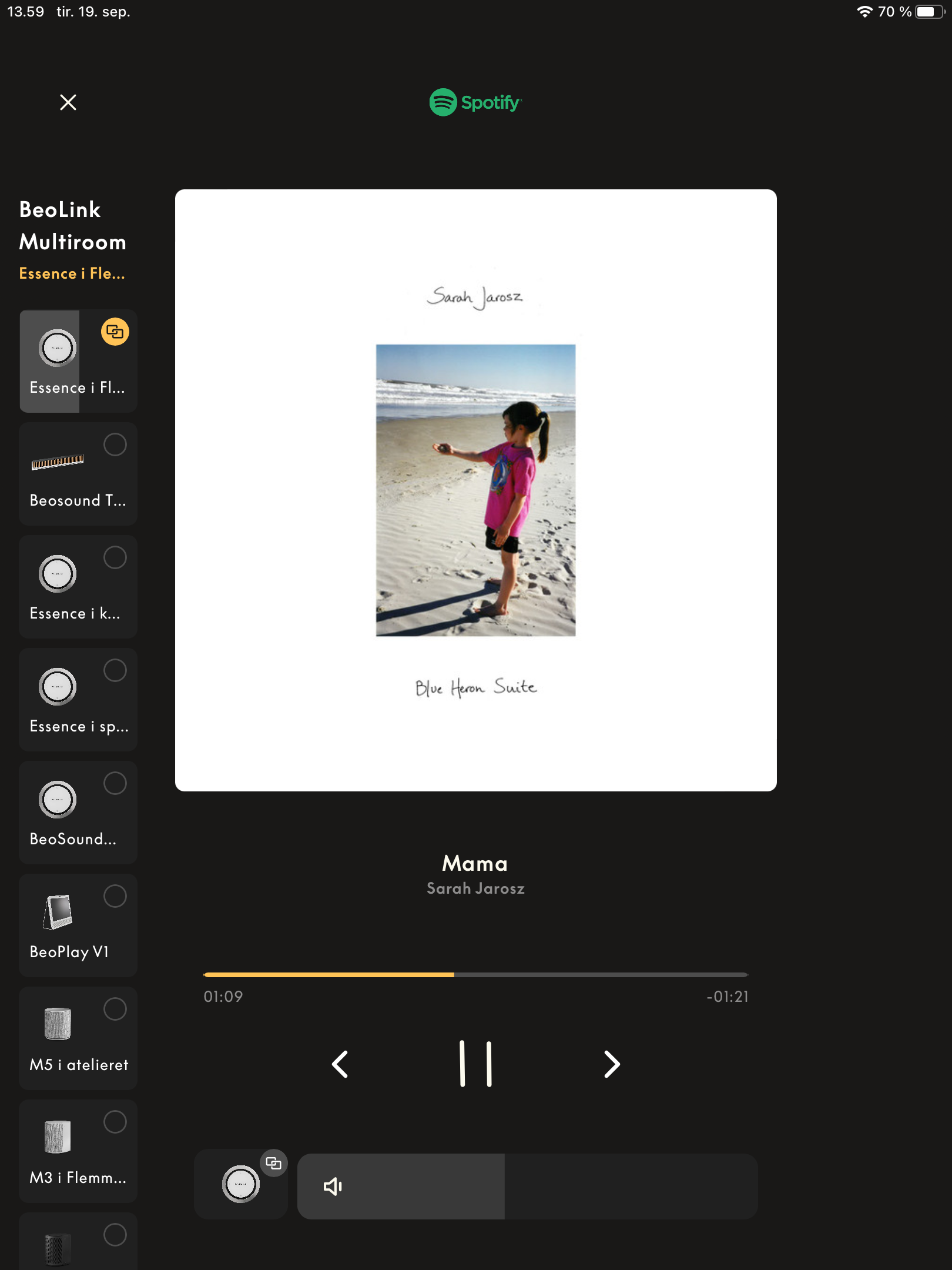
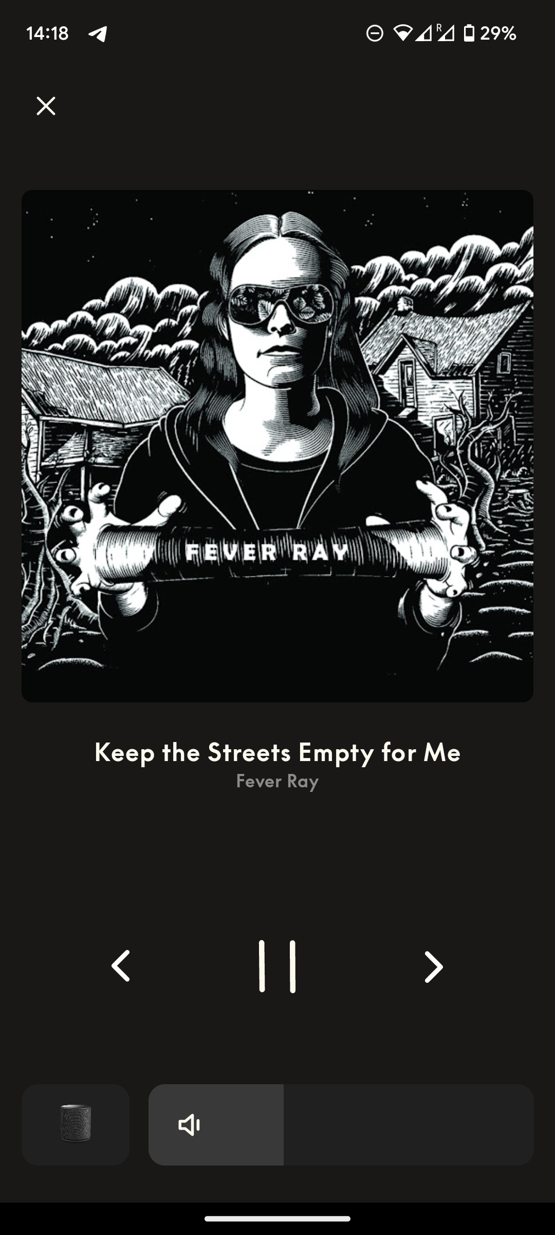
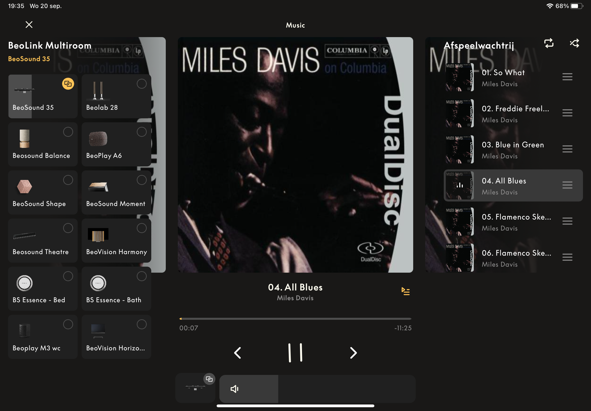
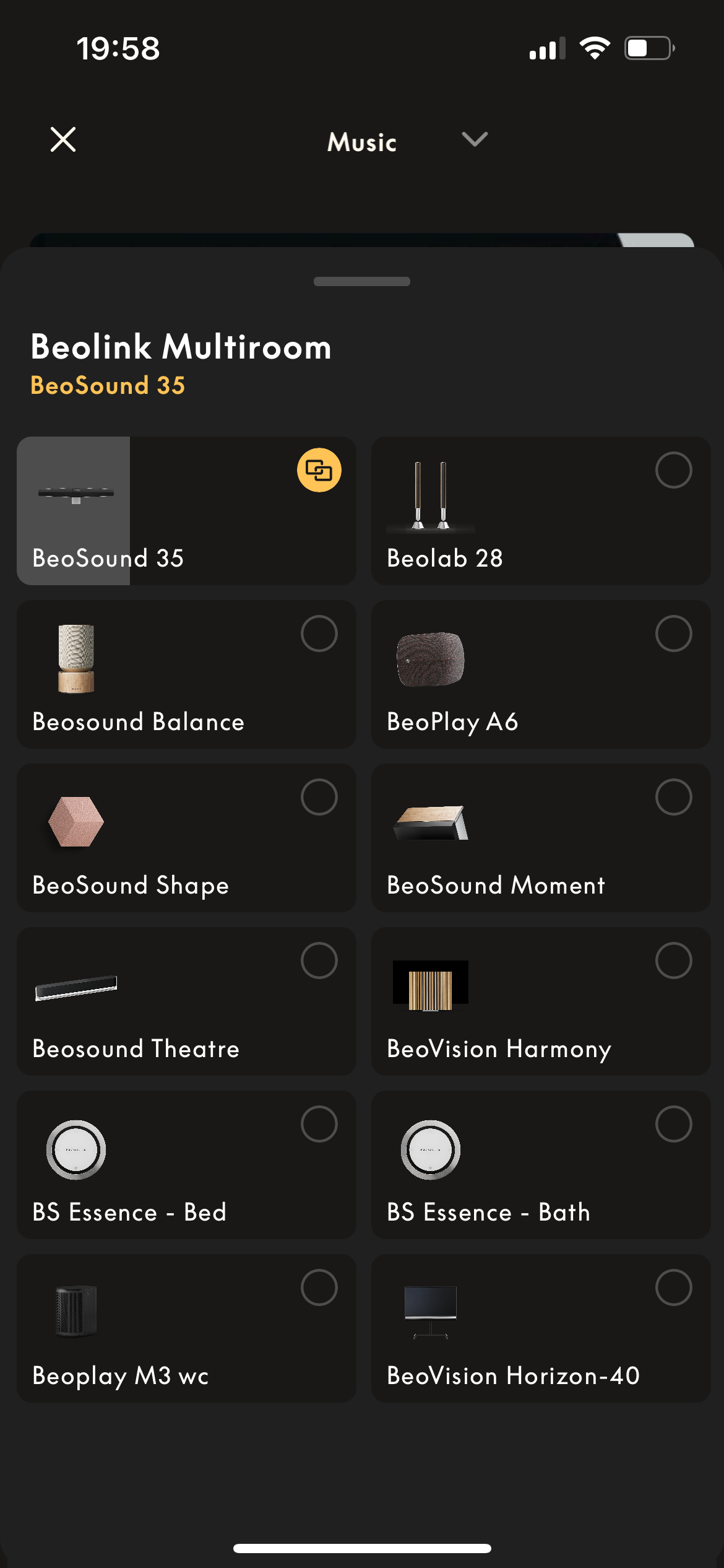
They have made a somewhat major change to the player section – see pictures.
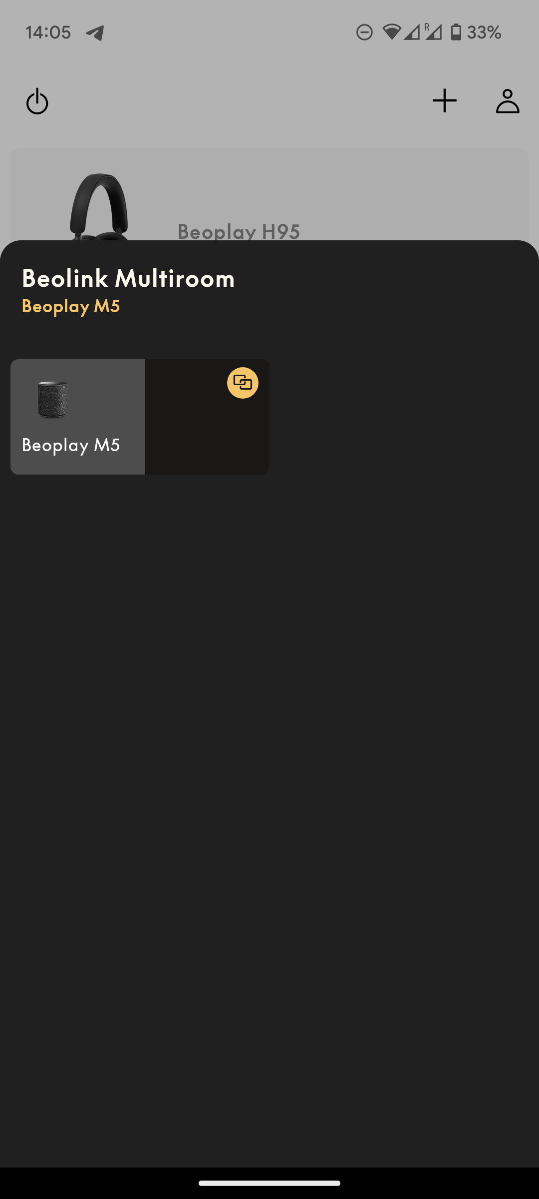
However, it was – at least to me – not obvious how to get rid of the multiroom side panel (if and when you don’t want it).
In my opinion it makes the player cluttered….less sleek.
(Previously it was a button at the bottom which opened a new page).But I did find out, that you can toggle that on/off with multiroom icon left of the volume slider = nice.
Would have been helpfull to have had the instruction from the beta team at start ?
All in all I like it.But….where are the access to the sources on the network?
I haven’t found it!
Probably something that will come later?
So beware, if you have only one device with the app installed – it might cause problems.
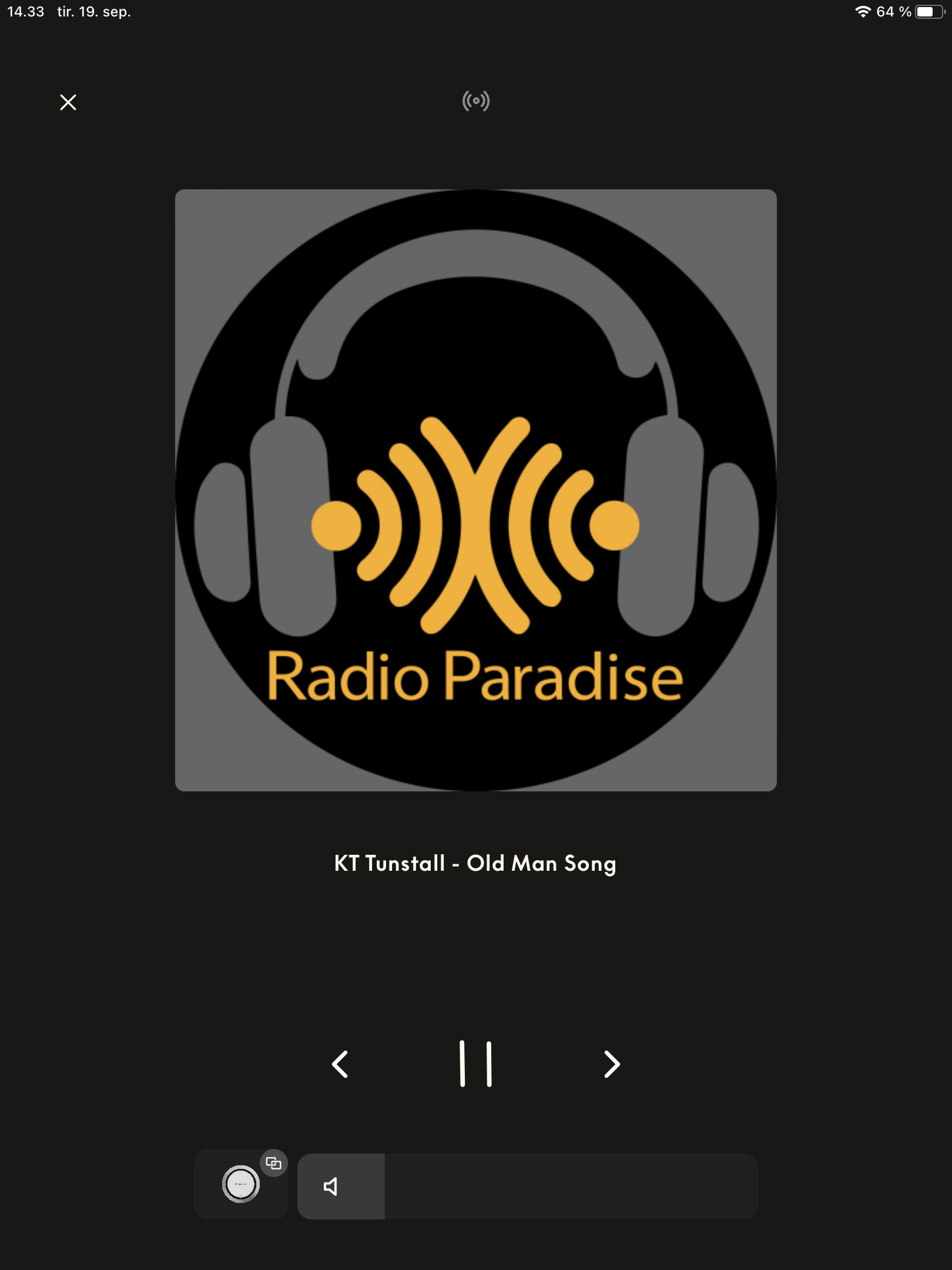
Of course you still can start playback via Spotify Connect/Tidal Connect.
And the Netradio still has a button on the main page.
But if you have linked sources and/or use the line-in of a device (for e.g. a turntable), there seems to be no way to access these.How is your experience?
MM

Source selection via the 3 small dots – example – in the regular version.

Location: Flensborg————Danmark
19 September 2023 at 14:46 #49057 NQVHNWIBRONZE Member
I have to be careful what I say because of any potential NDA issue.
I have reviewed the operation of the new BeoApp 5.4.0 and gave comments back on its usability and other issues.
19 September 2023 at 14:47 #49058matteventuBRONZE MemberI came here as soon as I tried the new player.
First I have to say that I work in software, so I know users are often against change for dumb reasons.
However.
B&O really needs to fix fundamental issues with the app before updating the playing screen in such a way that massively affects performances.
B&O app has always been laggy in some menus, with horrible scrolling stuttering (for instance, the “add new product” screen). At least, on Android.
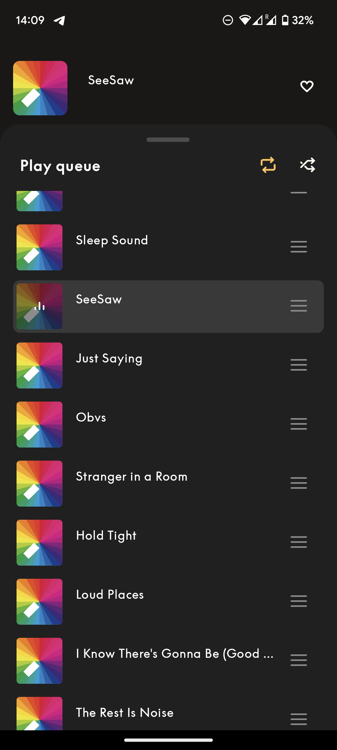
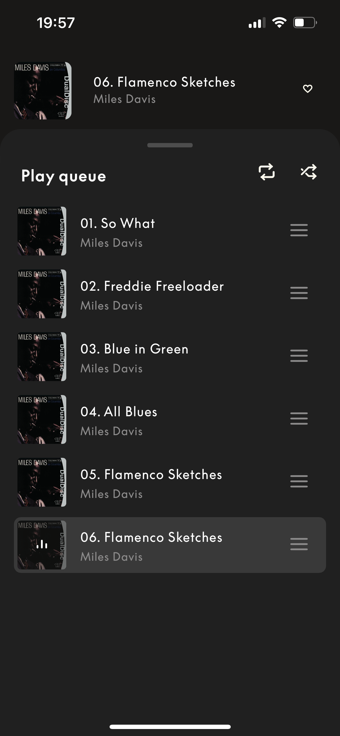
The new queue system they’ve implemented with the new player has the same scrolling stuttering issues. I could accept it in the “add new product” page, as it’s something you use once in a while. But for something as central as the queue tray, that’s not okay. B&O should first rewrite the app and clear up the codebase before redesigning something like this.
I see your screenshots of the iPad version. On the smartphone version the layout of the home page hasn’t changed as much.

I personally don’t dislike the new redesign, but it has some issues.
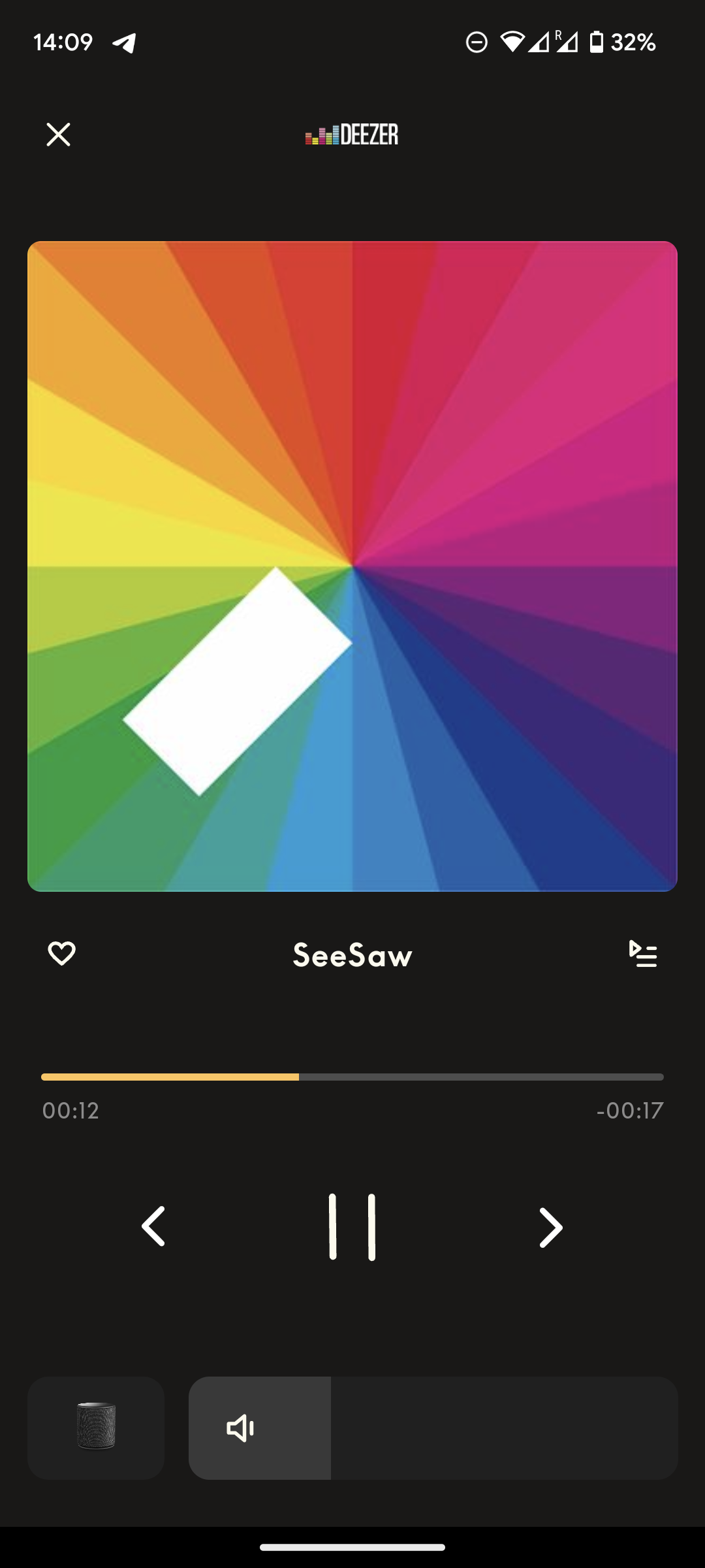
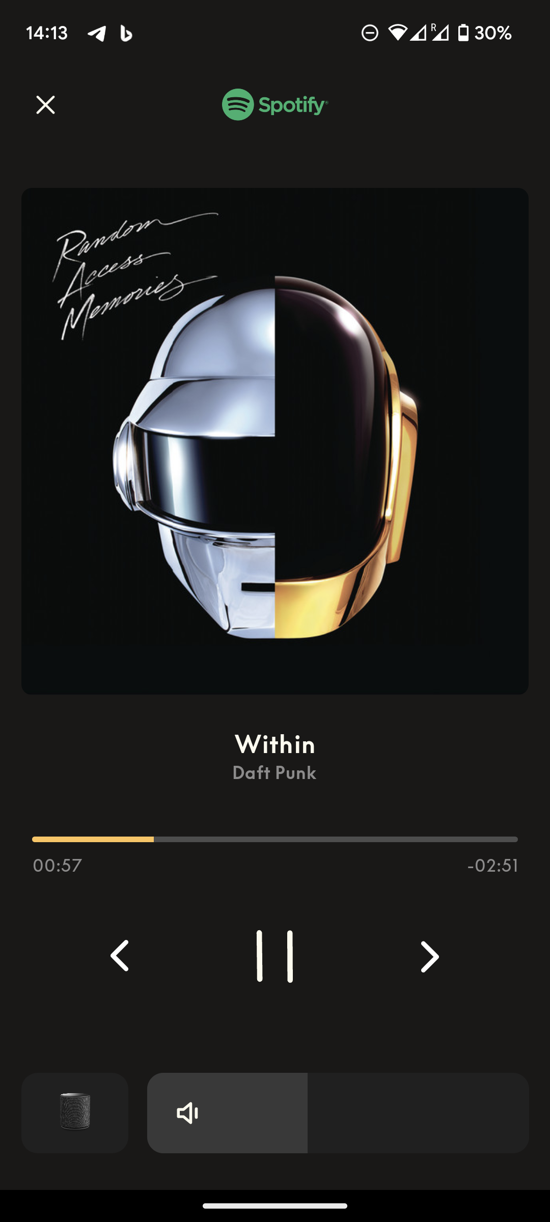
- Source selection/standby button missing
- Queue tray is extremely laggy and the “move” songs (drag & drop) action is completely bugged
- Swiping on the cover art to change song previously was perfectly smooth, now this is laggy too (animation has extremely low frame rate)
- The new volume bar is okay in terms of looks, but a regression on how easy it was to finely adjust the volume level previously (having the swipable area been reduced now to about 1/4 of what it was before)
- When you’re playing from Chromecast, it no longer shows the name of the source service / “Chromecast” at the top (in place of the Deezer/Spotify logos)
- …can’t say whether it will show “Optical” or “Line-in” correctly, as the source button is missing at all so you can’t switch source lol
- Prev/play/pause/next buttons now don’t offer visual feedback when tapped
- When the song title is too long and it needs to scroll, the scrolling speed is too high and the frame rate is very low
- When sources that don’t support/show the seek-bar are active (i.e. Chromecast, B&O Radio, and I guess all external sources), the positioning of the cover art, titles and prev/play/next buttons feels quite unbalanced
So, in a other words, the new player feels extremely cheap. Not very Ultra-High-Net-Worth-Individual worthy.
I say “feels” (instead of “looks cheap”) because it doesn’t necessarily have to do with the look. Look is okay.
Implementation/coding is instead very very poor.
Again, I know this is a beta, but this is the kind of things I’ve always seen passing from beta to stable without any change, so I really doubt they’ll fix everything before pushing to stable, or in the near future at all.
19 September 2023 at 14:48 #49059matteventuBRONZE MemberI have to be careful what I say because of any potential NDA issue. I have reviewed the operation of the new BeoApp 5.4.0 and gave comments back on its usability and other issue.
There’s no NDA on the Beta app 🙂
19 September 2023 at 15:00 #49060NQVHNWIBRONZE MemberThe biggest problem with the BeoApp (and this is in general and not 5.4.0) is that the whole interface is a mess.
The Front page – as I see it is a place for listing your equipment and for the front door for product configuration. You can go into deeper settings but there is not direct product control. You have to access that black bar (which is uncharacteristic in terms of styling from the rest of the App).
Unless you use the MyButtons, there is no why to control a Theatre. You cant CH+/CH- in live TV, you cant FFW/RWB on a streaming service or even control a PUC device. Further, you have to go to the most basic Player in any App in the history of all Apps.
As stated above, the BeoApp/Mozart is full of bugs, inconsistencies and certainly not a Luxury control interface or a luxury interface. But this goes on and on and on…with no end or real improvement in sight.
To me, it feels like the software developers are not in Denmark living and breathing with the products. More-over, its like they are in a Bombay call centre, trying to fix multiple and clashing software issues and the SW engineers only know that a “Bang” is the noise of an explosion and “Olufsen” sounds like an uncontrolled gas leak from somewhere untold?
That may be unfair……but the outcome is the same….Products cannot be controlled in a pleasurable and intuitive way like they were with the BL7000, 5000, Beo4 (or even Beo5/6).
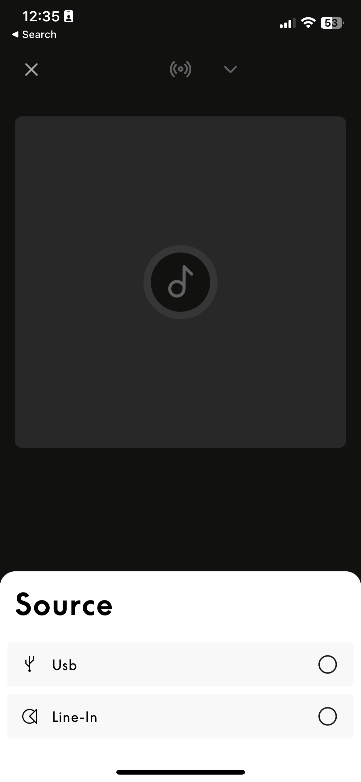
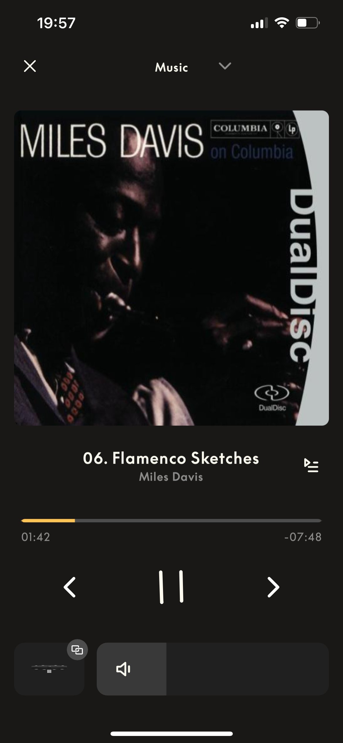
19 September 2023 at 15:16 #49061SandybBRONZE MemberIf you select a Theatre in the app to control, there is a drop down at the top of the black Now Playing screen.
Looks like this drop down should contain all the sources (as the 3 dots have until now).
But all it shows is Line In and USB.
I barely use the app beyond settings, so none of this especially bothers me – but it would nice if the rollout was not regressive in some respects.
19 September 2023 at 15:16 #49062I have to be careful what I say because of any potential NDA issue. I have reviewed the operation of the new BeoApp 5.4.0 and gave comments back on its usability and other issue.
There’s no NDA on the Beta app

So, maybe Mr10% is a beta beta tester!
Yes, that is from an iPad. I am definitely not going to test that on any other of my devices…..it is far away from being finished – even for a beta version.
It is interesting – and disturbing – that the Android version seems to be rather different from the Apple version.
Can’t say if it looks cheap – maybe just different.
The previous version sure had/has some quirks, but it worked for my purposes.MM
Location: Flensborg————Danmark
19 September 2023 at 15:42 #49063No source selection??? Seems essential!
It seems they only checked the iPhone to test the UI. With it faults, it looks okay on a phone, but imo for the moment it looks a mess on an iPad.20 September 2023 at 03:48 #49064matteventuBRONZE MemberIf you select a Theatre in the app to control, there is a drop down at the top of the black Now Playing screen. Looks like this drop down should contain all the sources (as the 3 dots have until now). But all it shows is Line In and USB. I barely use the app beyond settings, so none of this especially bothers me – but it would nice if the rollout was not regressive in some respects.
Out of curiosity, can you post a screenshot of the source drop-down that you get on Theatre?
(both in opened and closed state)
20 September 2023 at 10:31 #49065airmax_zhBRONZE MemberI know… lots of complaints here, and there’s still a lot to be fixed. But I still want to say: I really like the new design, looks way more modern and user friendly to me! Let’s see how they’re going to integrate the missing functions…
My B&O Icons:
20 September 2023 at 12:37 #49066SandybBRONZE Member 20 September 2023 at 15:08 #49067MbeeBRONZE Member
I can’t understand why they rushed to release this beta as the source selector is missing. For me it’s a no-go.
Putting the multi room controls on the player is a welcome move as this app is mainly useful for multiroom, there are less clicks.
New issue : no more volume control of BLC NL/ML. There was a special volume wheel for it because there was no feedback of the actual volume. They need to add this kind of special control but it’s more complicated with a slider… I just hope they will do something, because the temptation to do nothing may be high for a discontinued product…
20 September 2023 at 15:20 #49068I can’t understand why they rushed to release this beta as the source selector is missing.
Hi Mbee,
A VERY discrete down arrow source selector is hidden on the top line of the player’s screen, either on the Music or Radio screen.
In my case on BS1 and Core I just find “line-in”, no more bluetooth and ML sources previously available from BL/NL converter.
I agree with you, it’s a very annoying regression.
@ Sandyb, same list on my Theater.
Yann.
Location: Brittany, France
My B&O Icons:
20 September 2023 at 15:25 #49069MrAndersenBRONZE MemberHi all
Thanks for all your feedback on the new version we’re looking and fixing. You will see a lot of changes in the near future to the UI to make the more intuitive and nicer to look at. Some you will like, some perhaps not, but keep the comments coming, we read it all. I have some quick comments to your posts below.
- We should have had a better introduction to a big beta release like this, noted. We will do better.
- The source list was groomed too much, we just released a fix an hour ago for this. Some will not come back, for example Deezer. It only worked if Deezer had just been playing. In general, sources with a non-deterministic outcome will be removed.
- Poor performance on queue and swipe in the player. We will look into this, it is not happening in our test setup, but perhaps we need a larger queue to test with.
- Fix the basics, you say. General navigation between products is not good. We know and we’re working on it, stay tuned for more.
Br
Thomas, Bang & Olufsen
20 September 2023 at 15:55 #49070MbeeBRONZE MemberHi Thomas,
Thanks for the feedback. The second release gives the source selector but it’s still very limited (maybe you also deleted Music and Radio as there is redundancy with the buttons on the bottom menu bar?)
20 September 2023 at 16:24 #49071Thank you Thomas for reading and observing.
I also just received the second release of the new beta and want to share for other beoworlders, what I send as beta feedback.
”Another new version of the beta…..
I had hoped for some improvements.
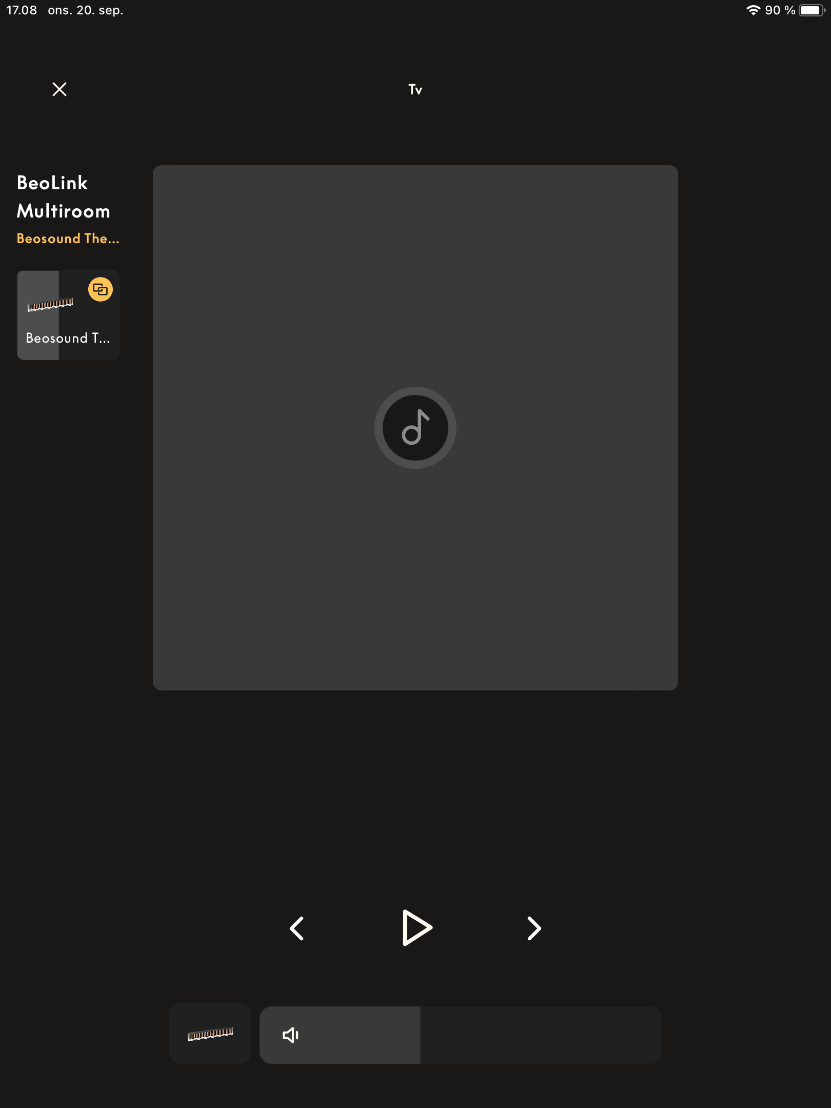
Opening the player (of my M3 and the BST) offers me this.
How am I to choose a source to play?
I can’t start any playback from here – it just says ‘tv’ or ‘Ingen kilde/No source’.Sure, I can go to the main page to start Netradio or access the files on my NAS.
Or I can play from extern via Connect (Spotify/Tidal) or Airplay/Cast.
But where are the sources that used to be hehind the 3 small dots?
How do I (on one of my many ASE based products) access my connected CD Player, how do I access a device on the line-in of a connected device or how do you access the built-in Deezer?There is still a lot missing – seems that this player is for people, who access their device/s from without the B&O app and who simply wants to control which other devices to play in the multiroom setup.”
This beta is – still – absolutely unuseable to me.
Would be nice to see some roadplaning for the app.
I am really tempted to roll this back to the previous 5.3 build ?N.B.
As you can see, this is the app on my iPad.
Whether it behaves different on other devices/iPhone I don’t know.By the way – it would be nice to know on which devices you are real life testing, before releasing the beta?
P.S.
I miss the volume ring!
That was some of what made the app special.
You can find these simple slider volume thingy in any other app ?MM
Location: Flensborg————Danmark
20 September 2023 at 18:50 #49072
For me to much covers! And you have previous-next buttons and the previous and next covers at the same time. Maybe it looks better if the previous-next covers are smaller in size (?) or skip them altogether!
especial if one choose the black bar in the main menu and all of the above info is shown immediately!
The “X” in the above left corner still annoys me! I keep pressing it to close the Multiroom selection. Would be nice to close this selection by swiping to the left.
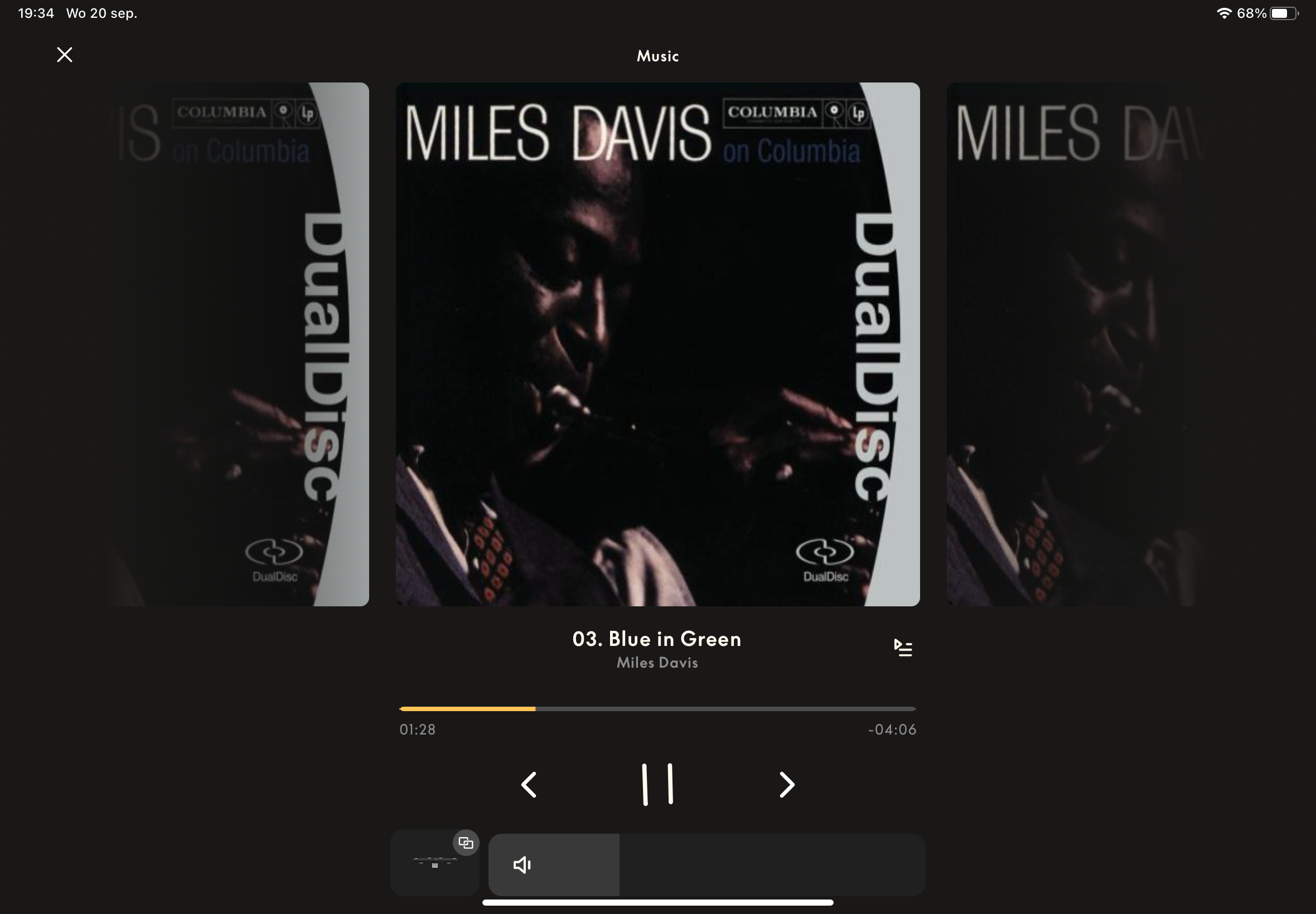
And of course close the Playlist by swiping to the rightBut on the other hand, I like the volume slider over the previous circle (it simply works better). And the Multiroom selection and volume adjustment are much nicer/better.
20 September 2023 at 19:04 #49073


On a iPhone on the other hand the Multiroom Selector and Playlist work as an layover. It looks good and seems to work flawless.
Maybe an idea to have the “now-playing” track also shown above the multiroom selector.
20 September 2023 at 19:37 #49074Floris2207BRONZE MemberHi,
I still miss the Tv input as an option. Since this is essential e.g. for parties when you want to listen to music and show some vids on the tv, without having to reselect the soundbar in the tv menu.
I know that non essential inputs were removed, but maybe put the Tv option as a source in when the Earc port is occupied. That way no one that has the theatre as sound system has a useless source. the same with the other HDMI ports, why should I care to click HDMI 1, 2 or 3 when all are empty? Beosound Theatre surely knows which inputs are used.
And don’t show it when the tv is playing as a source that will help in keeping it clean.

Really like the rest as an first impression, finally the queue works!!! After 3 years. (Was about to send it in as an issue, but if it keeps working it’s not necessary! Thank you!)
Although the circle was nice, I prefer the volume slider and really like the addition of the visual exact feedback from the volume. see picture, volume 57
20 September 2023 at 21:23 #49075NQVHNWIBRONZE MemberI’d go so far as if the App development team want to reach out to me…I’ll design you multiple page presentations on how the BeoApp and the Halo should look (obviously, your team will have to code it) that 90 to 95% of BW and other B&O oriented forum users would be happy with. it will take me 1 to 2 days max.
oh…and I will do it for free.
-
AuthorPosts


- You must be logged in to reply to this topic.