Home › Forums › Product Discussion & Questions › BeoGram › Poll – Beogram 4002 detail…
- This topic has 9 replies, 7 voices, and was last updated 3 years, 3 months ago by

-
AuthorPosts
-
18 December 2022 at 09:26 #41565
 Moderator
Hi alls,
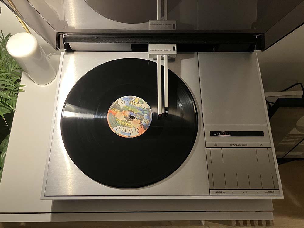
I’d like to have your view on something that bothering me since the Beogram 4000c pictures appears around with these deep black, perfectly aligned grooves (we all know don’t exist in real life, but still…).
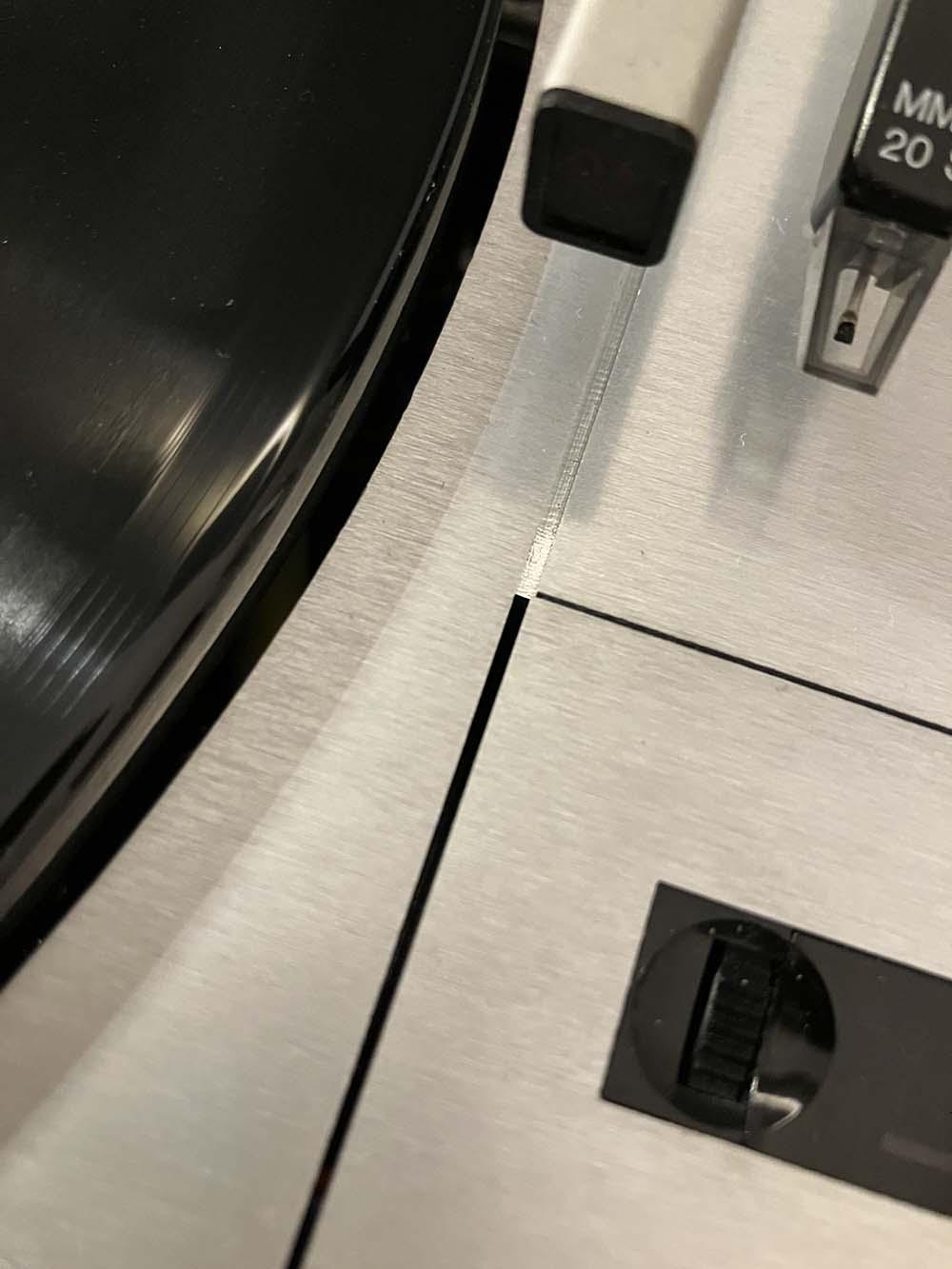
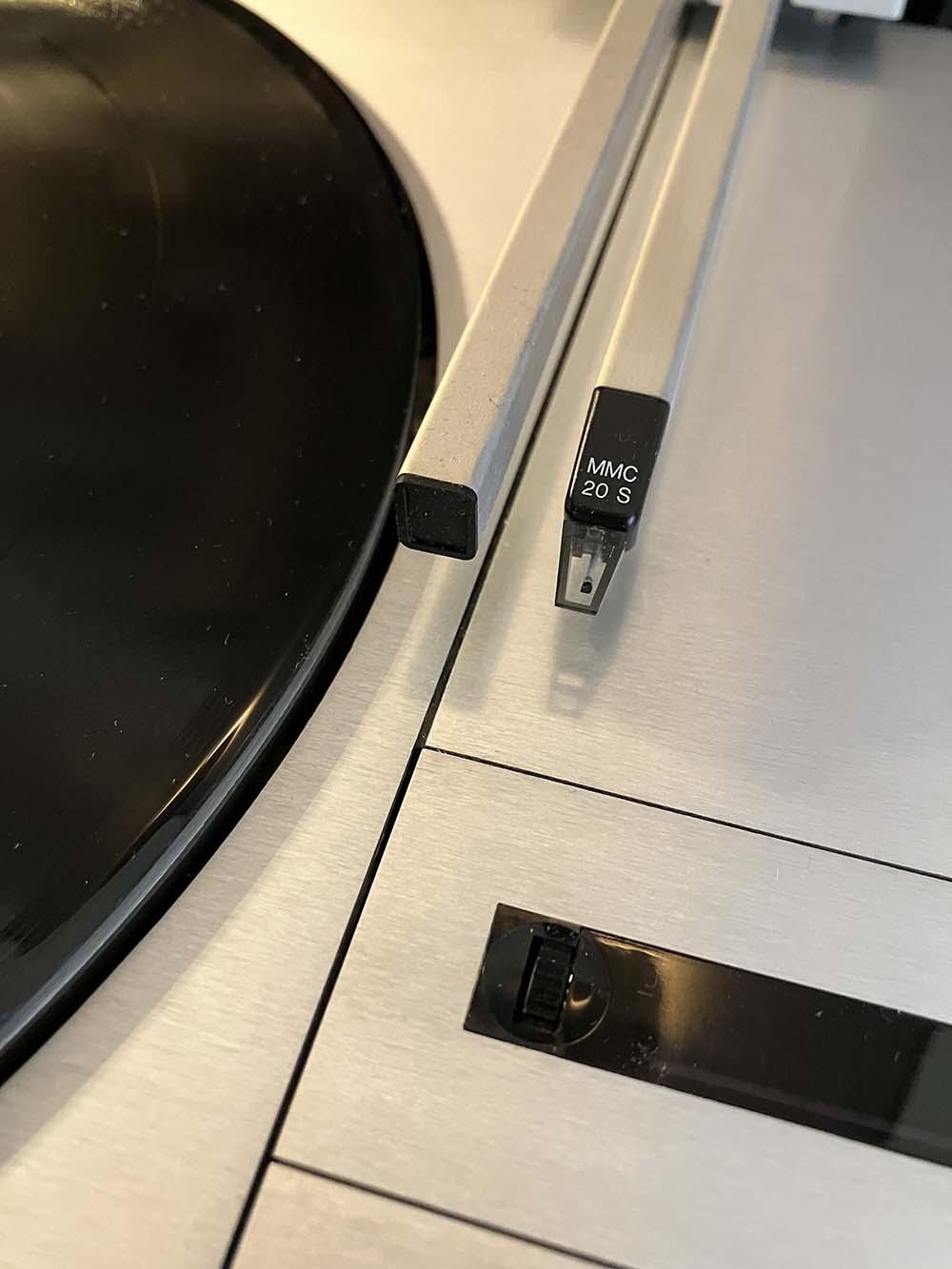
Id like you to look at the groove between the main table and the top right panel: is it better natural or underline by a black separation? What do you think?
Thanks.


Location: Paris France
18 December 2022 at 21:42 #41566etype76
BRONZE MemberTo my eye, the first pic with the separation looks better. More in line with the rest of the panels.
The 2nd pic I can see the edge of the panel as it looks ever so slightly raised but it maybe the camera.
It looks sweet in both anyway!
18 December 2022 at 23:19 #41567Mark
BRONZE MemberThe first picture is more pleasing to my eye also.
19 December 2022 at 06:45 #41568bulldog123
BRONZE Member#1 for me too
19 December 2022 at 14:32 #41569I think the first picture looks better, too, but it’s irrelevant as the cartridge is the wrong colour in both pictures!
:o)
19 December 2022 at 16:09 #41570Dillen
ModeratorI think the first picture looks better, too, but it’s irrelevant as the cartridge is the wrong colour in both pictures! :o)
So is the light at the speed dial. Looks all LED’ish.
Can’t your panels align properly?
Martin
19 December 2022 at 19:18 #41571 Moderator
I think the first picture looks better, too, but it’s irrelevant as the cartridge is the wrong colour in both pictures! :o)
Yeah, I know that and it’s hurting my eyes, but we have the cartridge we can…
Location: Paris France
19 December 2022 at 19:27 #41572 Moderator
So is the light at the speed dial. Looks all LED’ish.
Picture effect: light are usual lamps and shines orangish in real.
Can’t your panels align properly?
They are as much as they can in the three dimensions. The shining line is from the “lip” from the upper right plate that goes under the main table.
Location: Paris France
19 December 2022 at 23:16 #41573Glitch
BRONZE MemberI think the black line looks better. Now every time I see one of these I’m going to notice the seam ;-).
Could you put a piece of black electrical tape on the lip? That would give you the “black line” look and would be reversible if you don’t like how it looks.
Glitch
20 December 2022 at 13:47 #41574 Moderator
Could you put a piece of black electrical tape on the lip?
It would be difficult I think because the lip is a tight fit under the main plate and down to these level, electrical tape is quite thick.
What I did is to cut a square rubber belt and tuck it in the groove: absolutely reversible, no arm to any part, quickly removable in case of an unexpected hardcore beo-lover visit, and to my eyes, better looking.
In fact, possibly better looking for B&O marketing people too, as they did emphasis (with photoshop) those black separation in every picture of the Beogram 4000c.
Thank you to everyone who gives is view.
Location: Paris France
-
AuthorPosts
- You must be logged in to reply to this topic.


